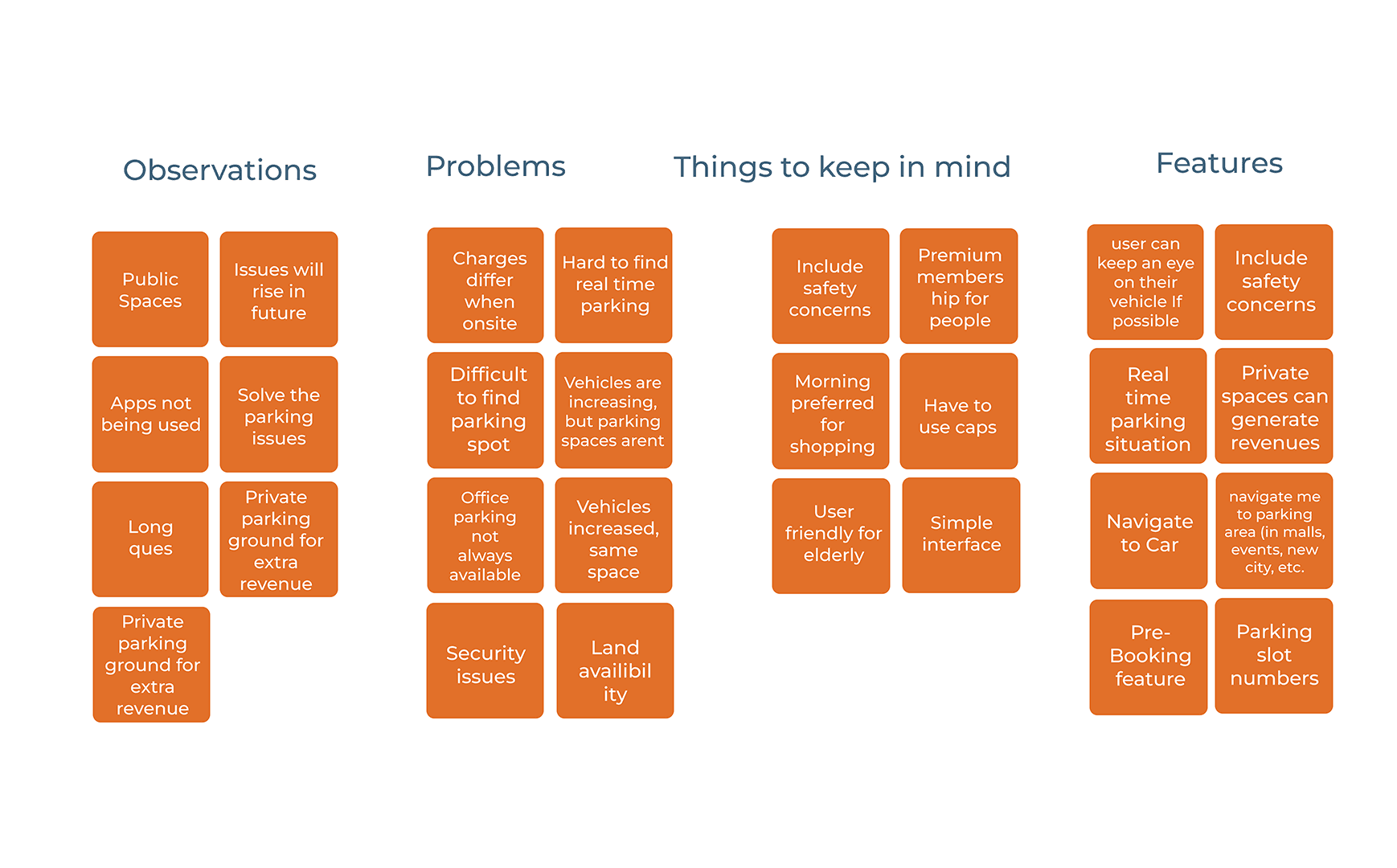
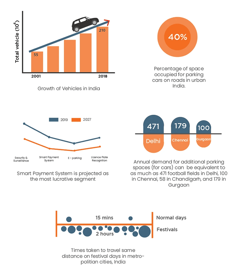
The application was specifically designed for South-Asian countries keeping in mind the levels of increased population, road connectivity, seasonal effects and festive conditions.
TIMELINE
09/06/2022 - 13/04/2023
The project was a team effort of total 3 members during my time my at undergraduate course of Product Design.
PROCESS 🖊️📋👨🏻💻
Research
Our project aiim
Secondary data
Existing solutions
Market Insights
Integration
User persona
Context mapping
Information architecture
Crafting
Style guide
High-fidelity
User interface
Prototyping
Figma prototype
First-time User experience
Development areas
Reflections
User testing
Future work
1
2
3
4
5
DOMAINS
User Experience Design
User Interface Design
Advanced Data Systems
Human Cognition
Data Visualisation
RESPONSIBILITIES
Research
Sketching
Initial User Interface
Visual Interaction
TOOLS
Adobe Photoshop
Adobe Illustrator
Adobe InDesign
Adobe Premiere pro
Adobe XD
Figma
Procreate

After clarifying our project goals and priorities, we conducted a comprehensive analysis of existing competitors in the market. This involved mapping competitors based on key parameters such as market leaders, niche players, emerging contenders, and diverse offerings.
PRE-BOOK SPOTS
REAL-TIME DATA
MERCHANT FEATURE
FESTIVE OPTIONS
OUR PROJECT AIM 🎯👀👨🏻💻
MARKET ANALYSIS & SECONDARY DATA 📊 🚘 📄
Understanding the domestic market, where the application would be primarily used, was essential to our strategy. Additionally, conducting a thorough competitive analysis provided us with a comprehensive view of the market landscape.
This analysis helped us identify key players, understand strengths and weaknesses, and recognize market trends.

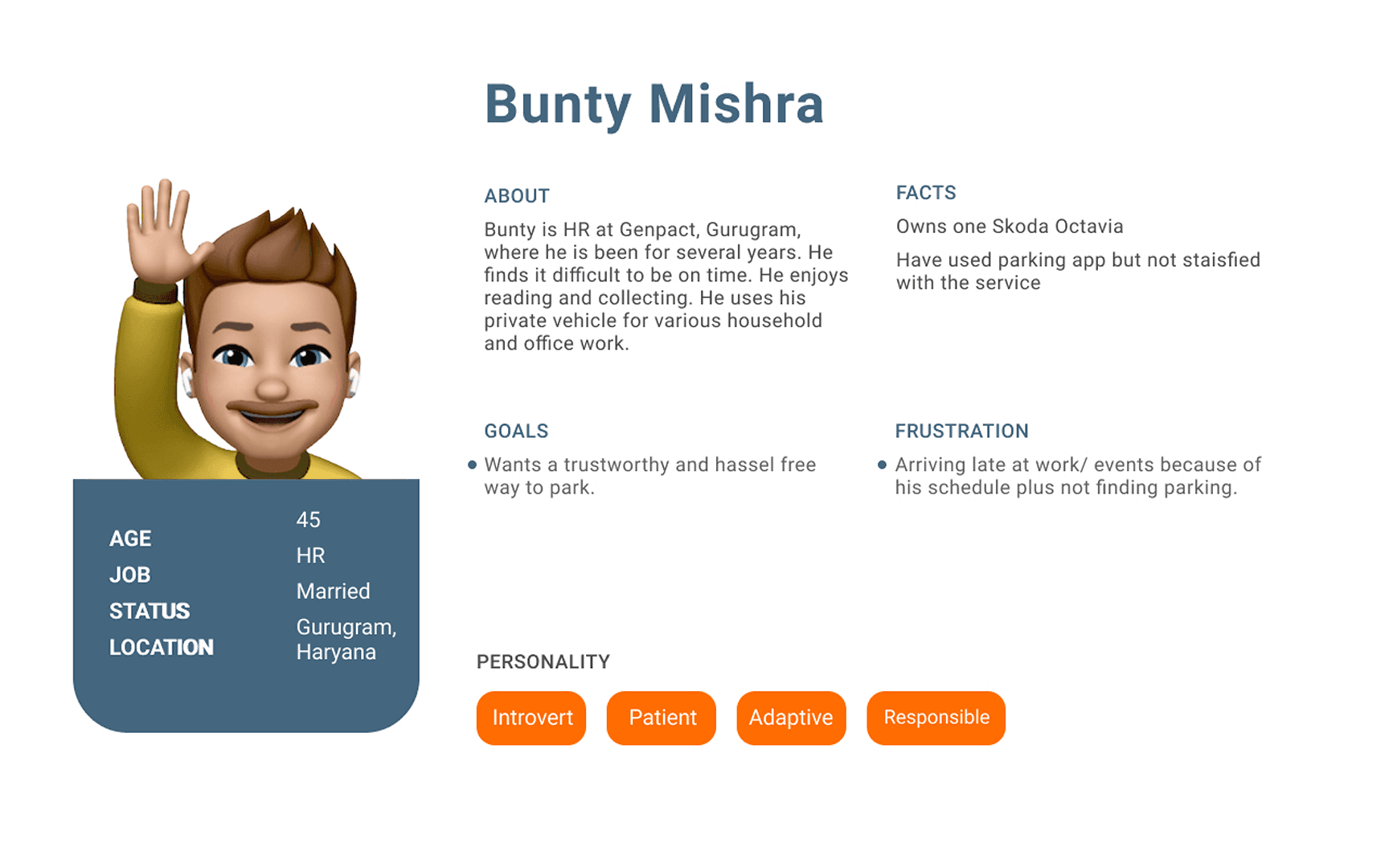
USER PERSONA 🚗📍🌏
The personas we developed spanned from young adults to working professionals, encompassing a wide range of vehicle owners who regularly grapple with parking challenges in their daily lives.
User flow diagrams were like a roadmap, helping us understand how users navigate through our system and where they might encounter hiccups.
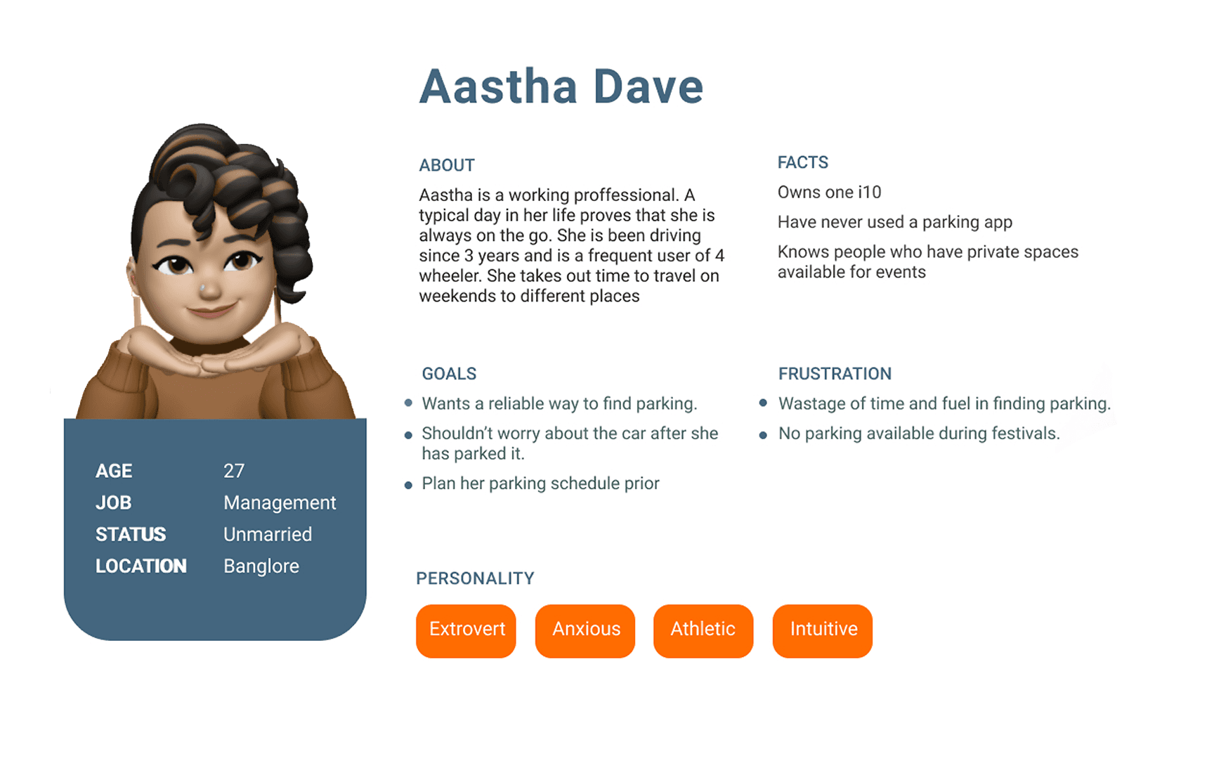
The persona category ranged from young adults to working professionals covering vehicle owners interacting with parking issues of daily basis. This diverse representation allowed us to capture varied needs and experiences of individuals who interact with parking issues on a day-to-day basis, ensuring our solution resonated with a broad spectrum of users.

+
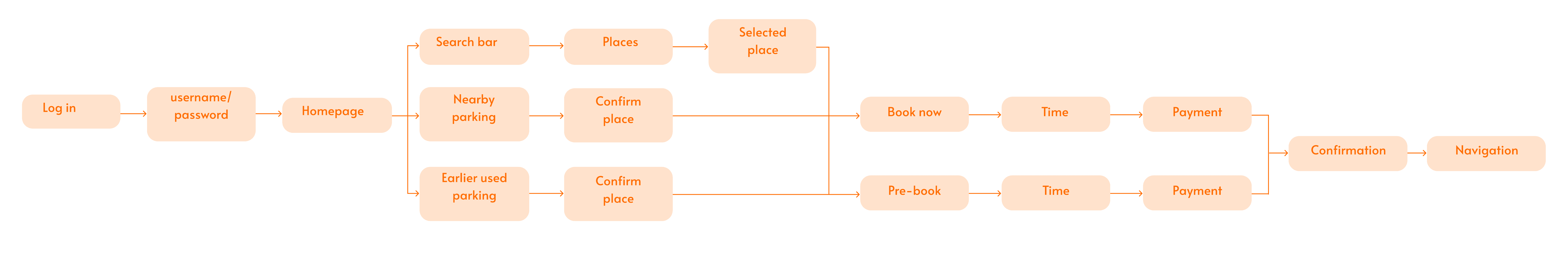
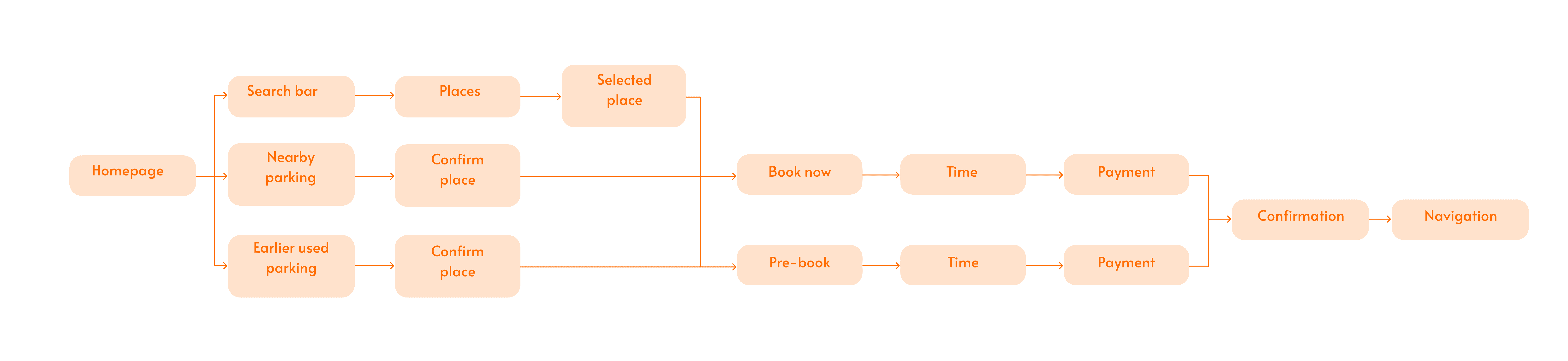
This visual aid gave us clarity on how to redesign certain parts to make interactions smoother, ensuring everyone has a hassle-free experience.
LOW FIDELITY WIREFRAMING 🔜👁️💻
After conducting our research and organising the insights into actionable points, we began the design process by creating low-fidelity wireframes.
These initial sketches helped us build a solid foundation for the application. By focusing on structure first, we ensured that the design was user-centered and addressed the key needs identified in our research.
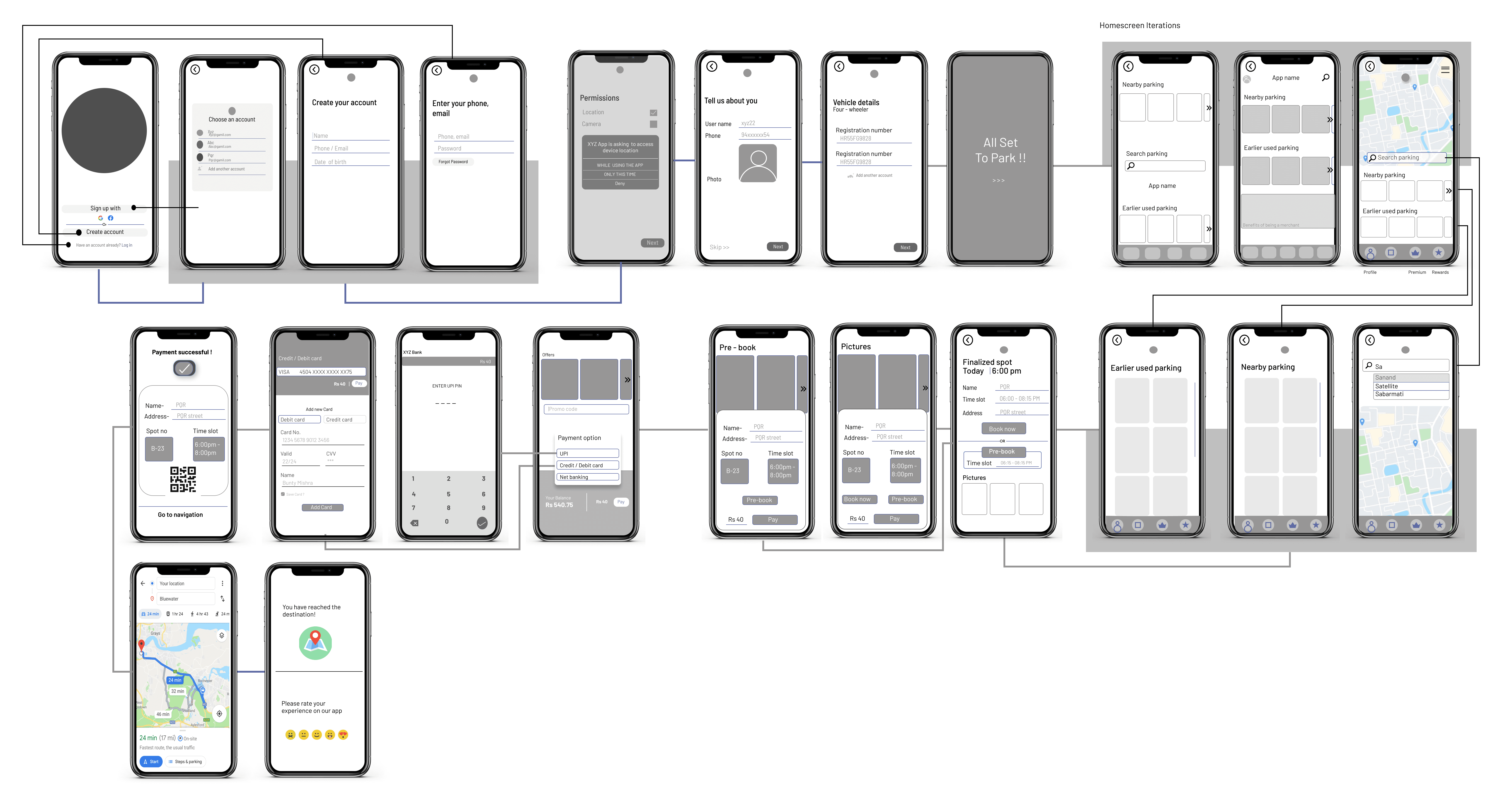
This step-by-step approach allowed us to iterate and refine the design, creating a directive, effortless and intuitive user experience.
This structured approach ensured a clear understanding of the user journey and interaction points, allowing to design a seamless and secure user experience.
Additionally, since this was an experiment-based approach, instead of doing initial wire framing, more time was given to prototyping in mixed reality phase.
Having multiple pages filled with notes during discussions, and critiques throughout the project, I added a few of them to validate my design decisions which emerged as a collective response.
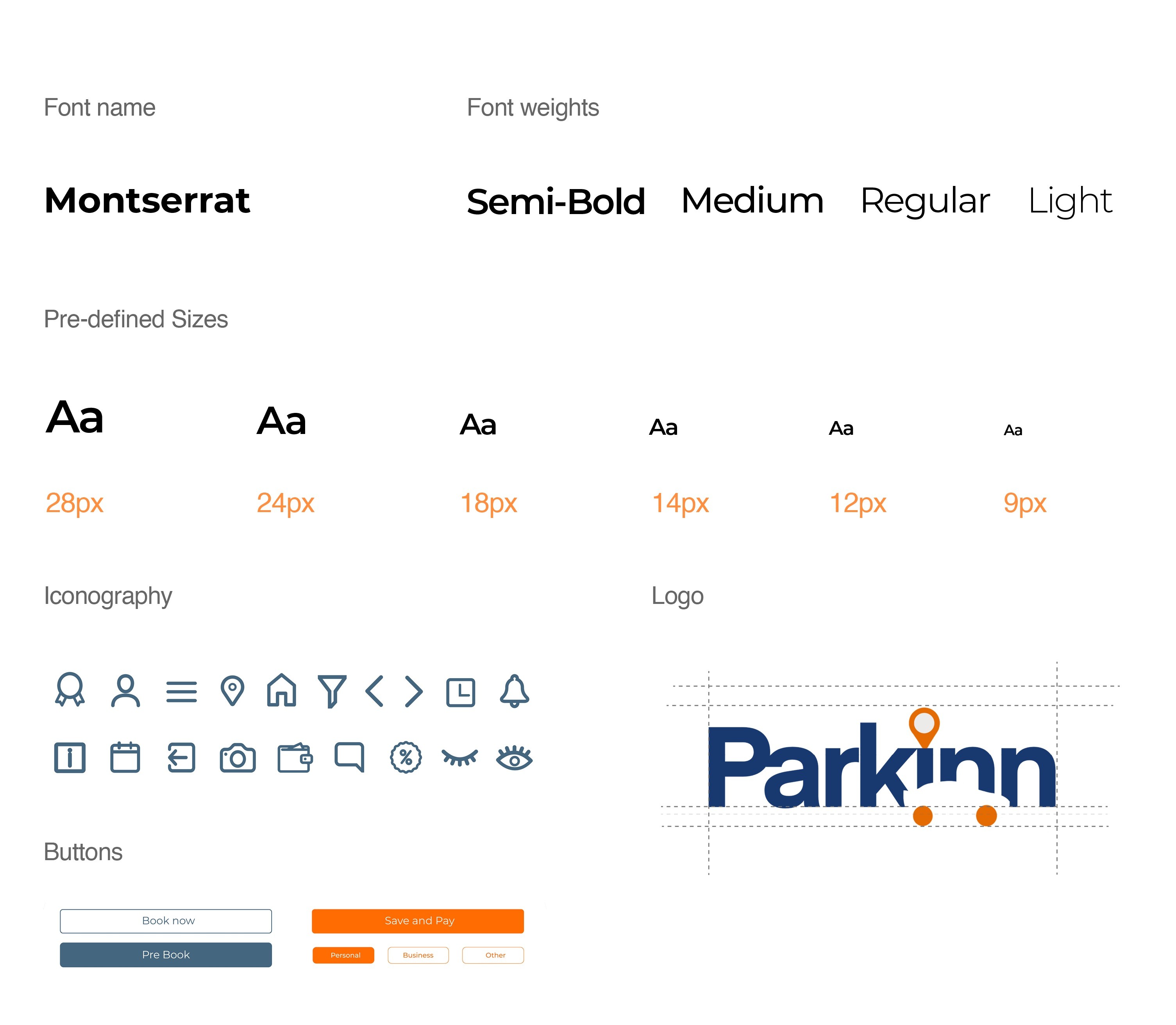
Specifying fonts, text sizes, font weights, icons, buttons and more made the application to fit properly in a structured way, navigating rightly for the user.
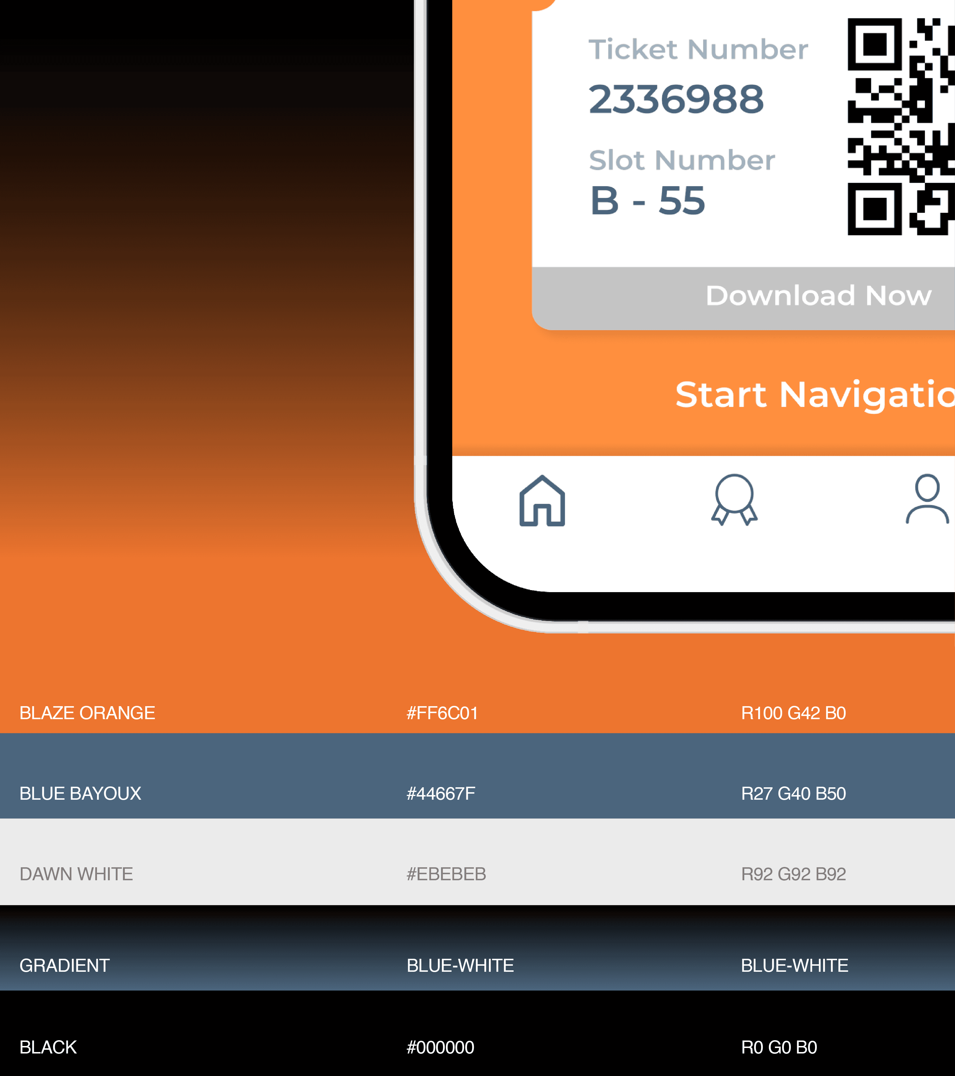
STYLE GUIDE 👗🌈💻
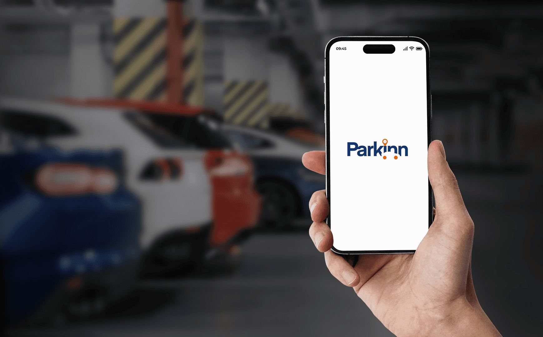
Parkinn
Parkinn is the one stop solution for all your hassle-free parking needs in different cities.
It searches the best parking spot with availability, your flexibility and enables people to rent out their space as a parking location generating additional revenue.
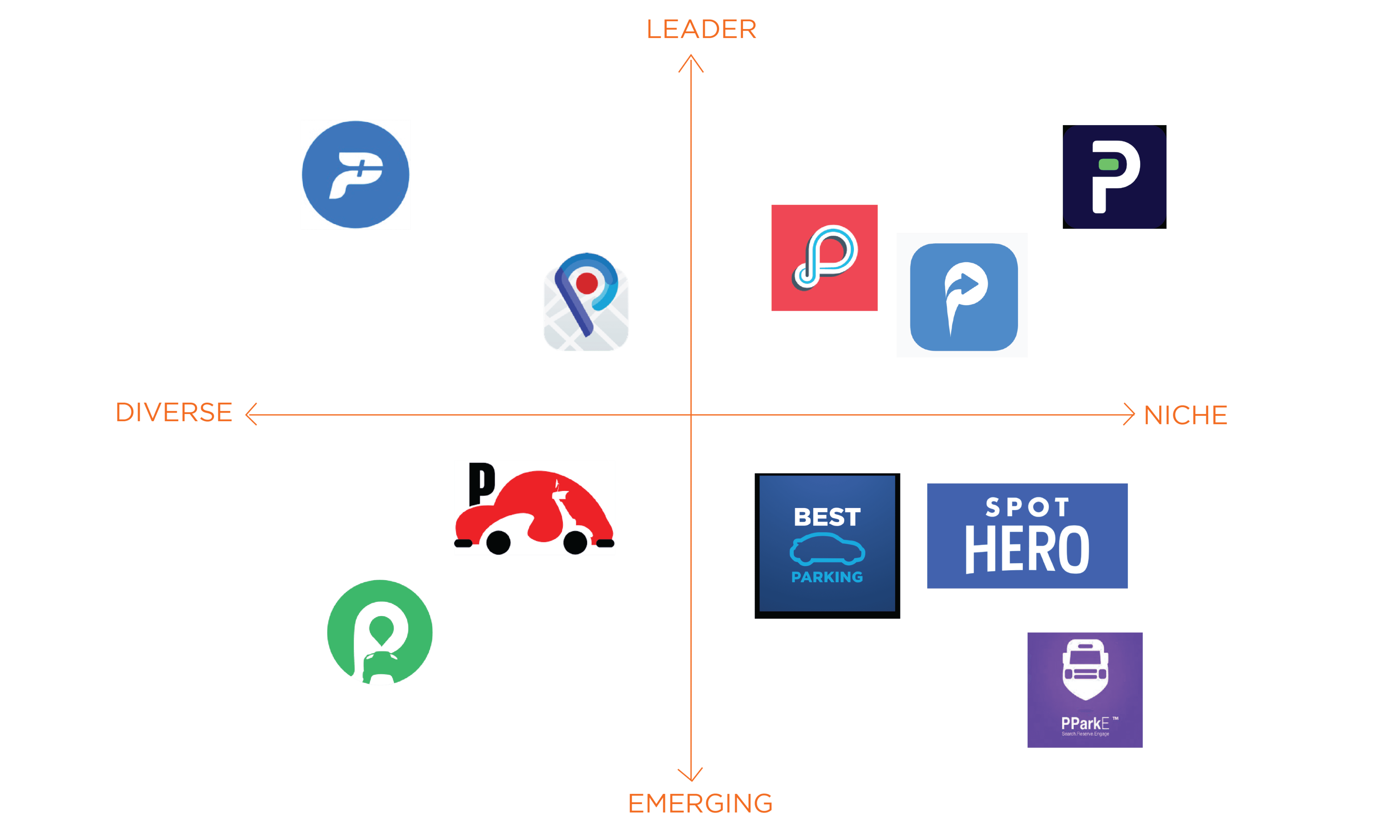
By categorizing competitors in this manner, we gained valuable insights into the competitive landscape, helping us identify opportunities and threats. This strategic assessment informed our approach, ensuring our project could effectively differentiate itself and address gaps in the market
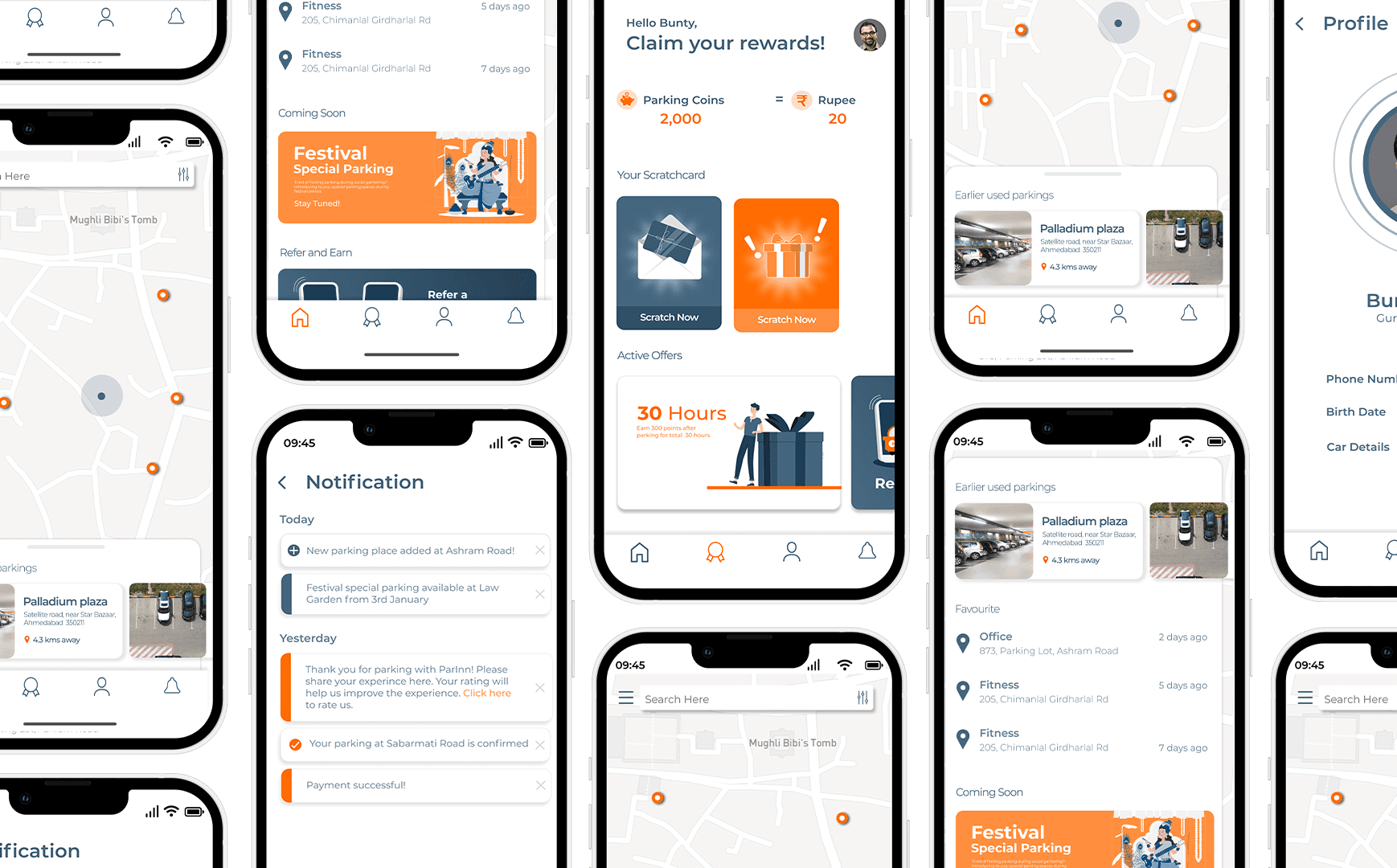
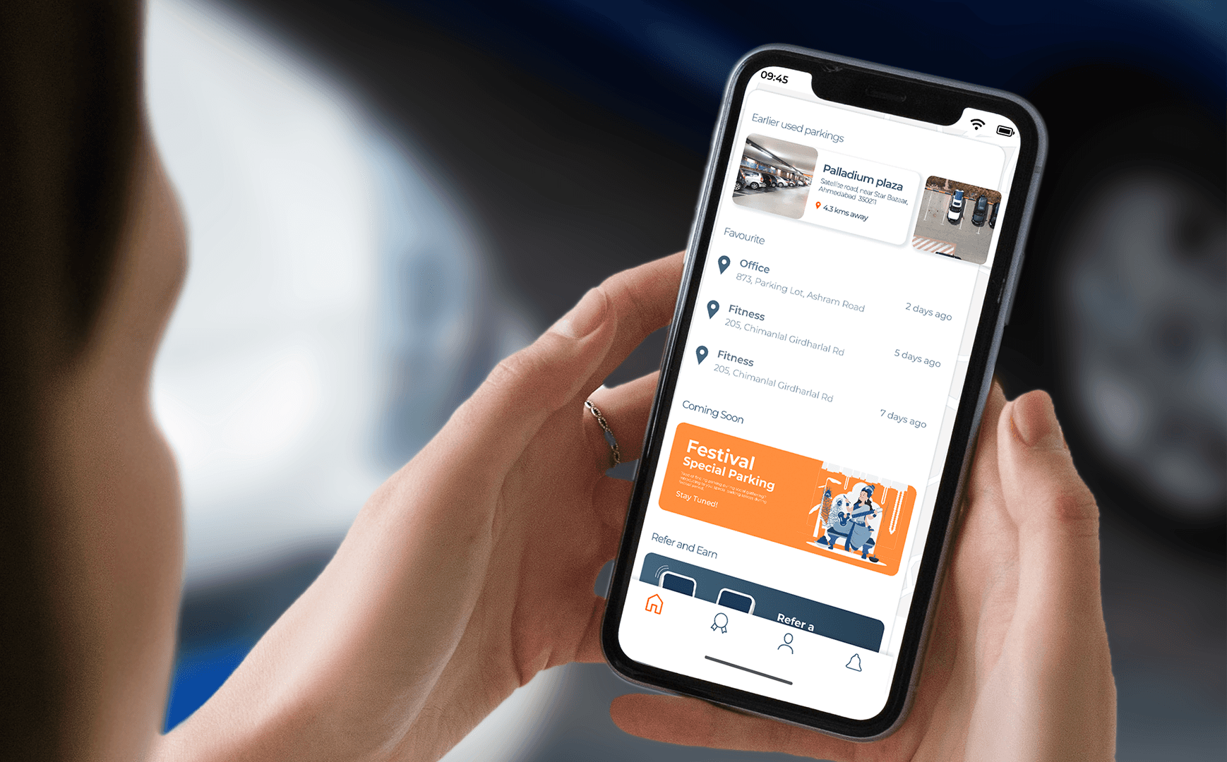
Home screen visualizes many useful features like used parkings, history, nearby spots, account rewards, favorite parking spots, upcoming festival parking arrangements and many more.
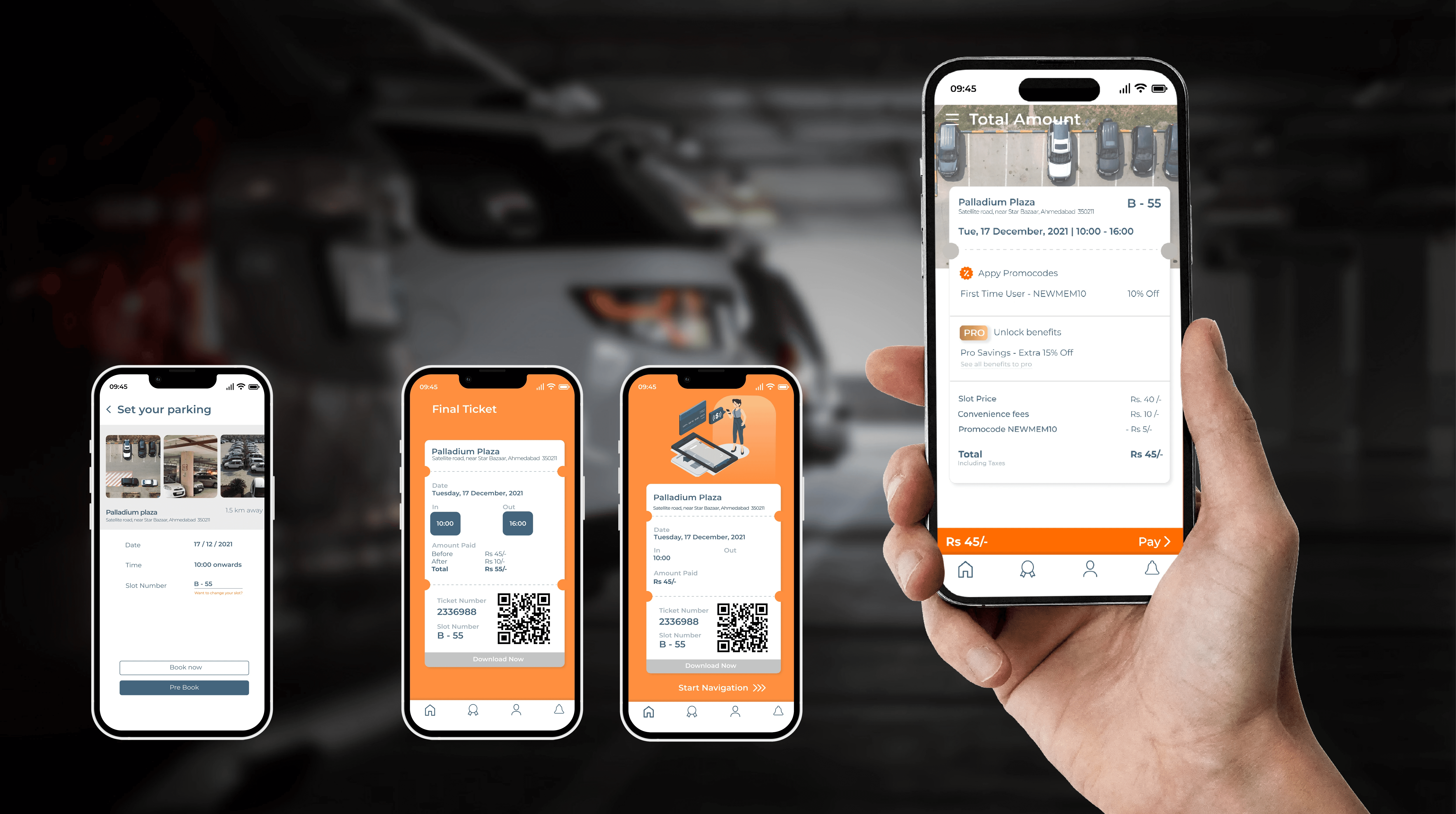
Once the spot is finalized, add all the required details (date, time, slot number) and proceed with payment options. All of the details like parking time, location, car information gets registered automatically once you confirm your ticket and pay.
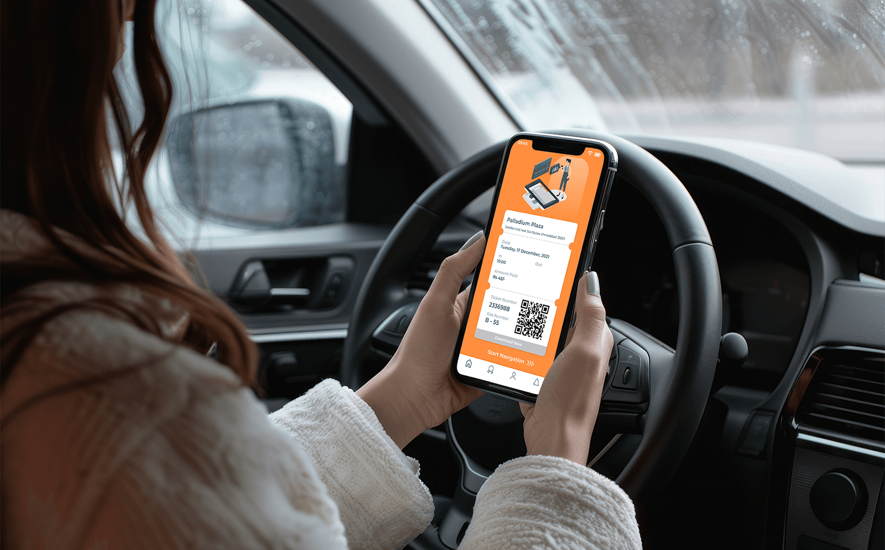
This feature lets you pre-book your parking as well! You will receive a ticket confirmation by which you can just scan into the scanner at the parking facility and park your car hassle-free.
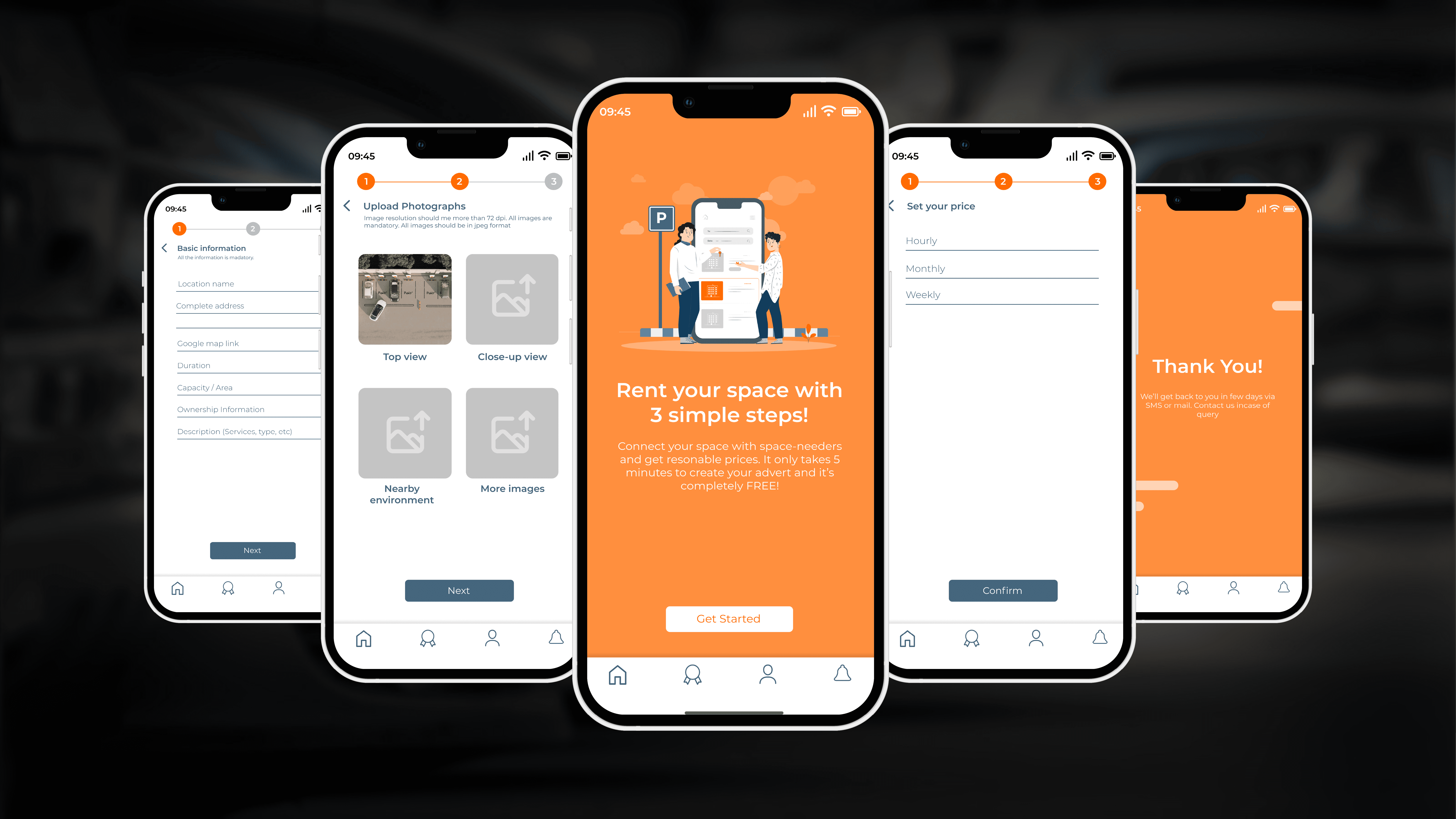
Merchant setup lets you rent your space as a parking sport for others and lets you earn extra revenue on the side. The setup is easy with adding details, location, photographs of the space.
Prototyping video
USER TESTING & FUTURE ITERATIONS 🔜 🙇🏻♂️ 🧐
t was significant to user test our design in actual user environments to understand how well the design interacted in critical situations of finding parking spots, in traffic, or while navigating towards the destination.
Two critical aspects of user scenarios were in outside parking lots with direct sunlight, and inside car in basement parking lots.
This way we user tested both scenarios to inspects color coordination, font legibility, navigation screens, easy access to frequently used parking spots, different locations and more.
Further actions include iterating designs based on user testing insights and improving on existing layouts.
Team: Labdhi Mehta, Sanskar Singh Naruka, and Tejas Gaikwad.

USER INTERFACE 🔜👁️💻
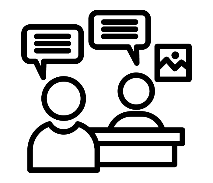
UNDERSTANDING CONTEXT & USERS 🙋🏻♂️🔎💬
+
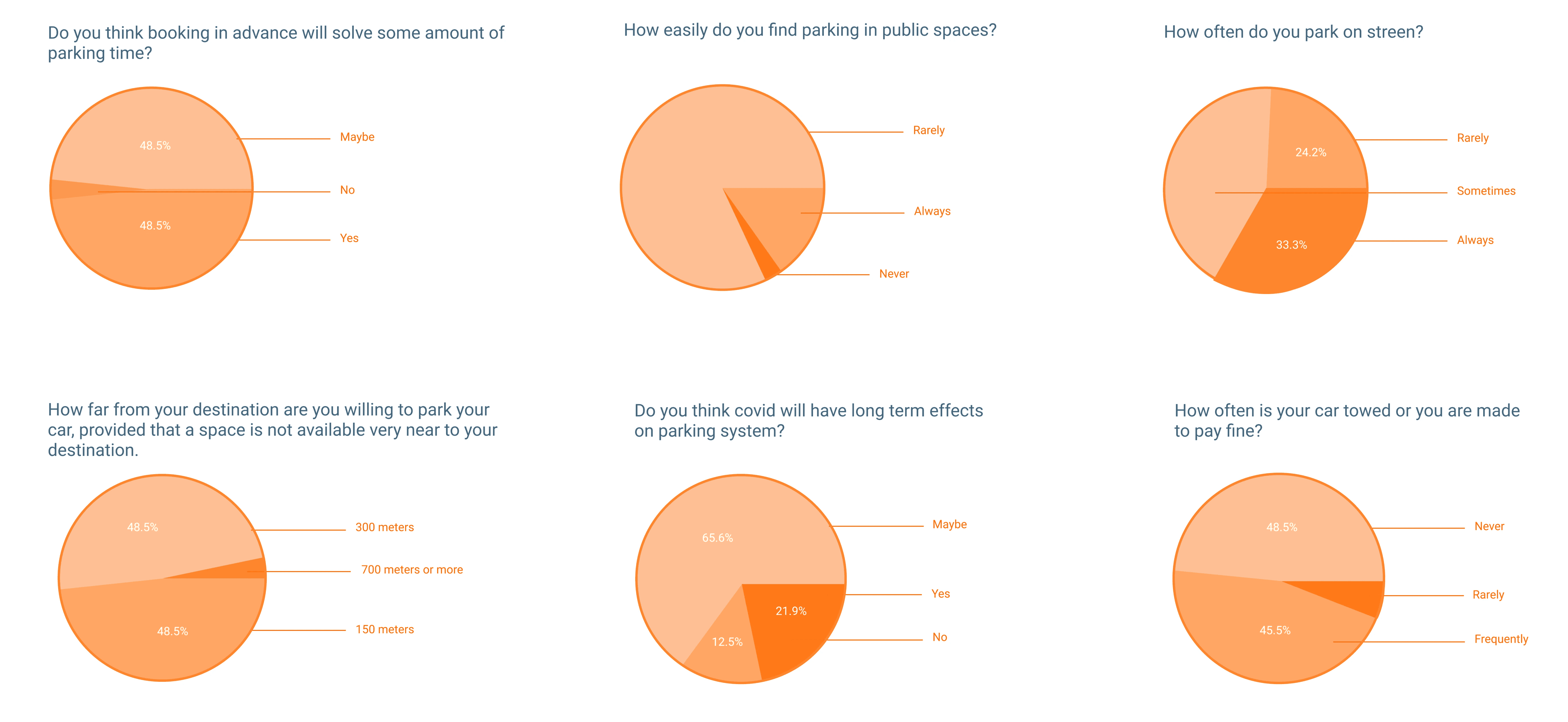
- How easily do you find parking spaces in public spaces?
- How often do you park on street?
- At what time do you face major parking related issues?
- Have you used a parking app before?If yes, which app you use and what functions you like in that app?
- Do you think booking in advance will solve some parking related issues?
- What features should a parking app include according to you?
REAL-TIME DATA
MERCHANT FEATURE