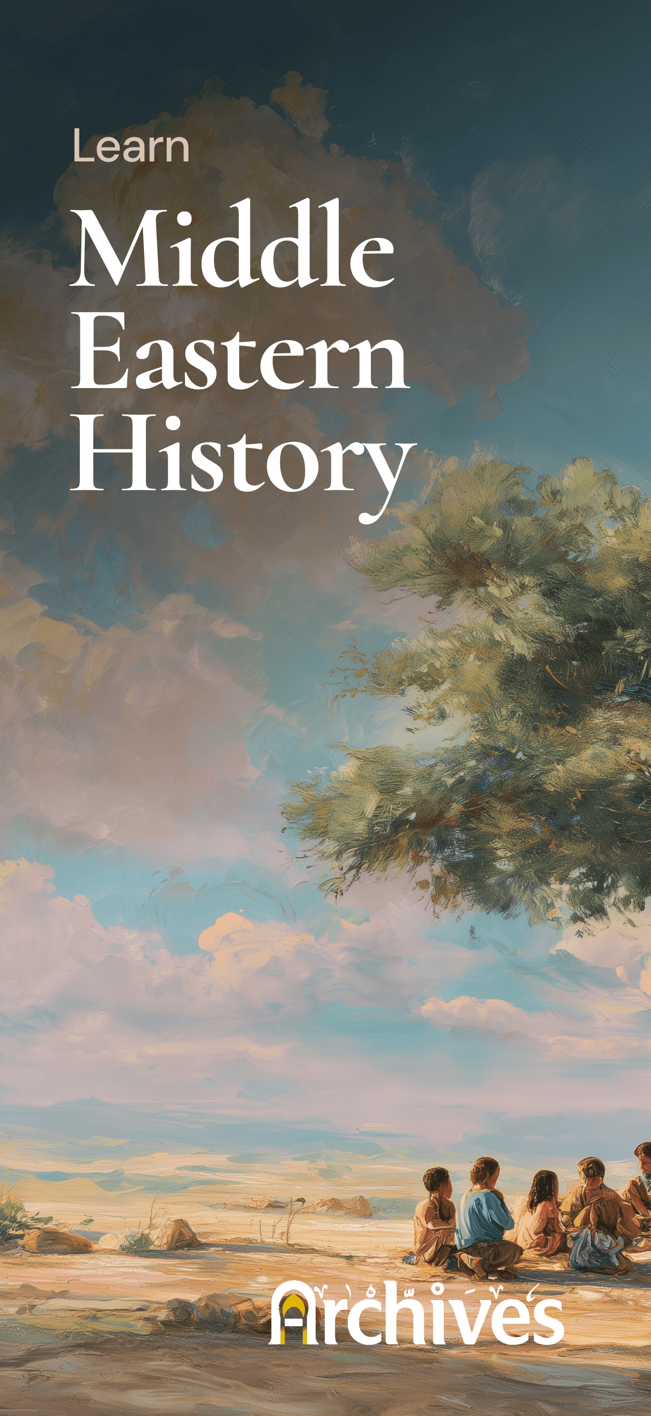
Archives
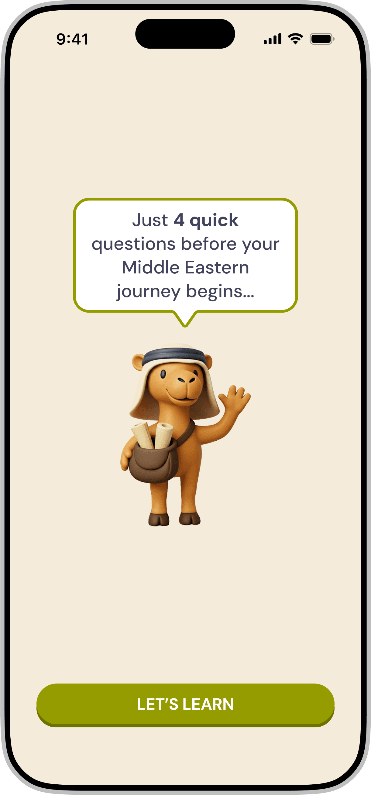
Redesigning a gamified mobile application for iOS & Android that introduces Middle Eastern history through interactive storytelling and character-driven experiences.
My role as a Product Designer was to establish visual identity, redesign core user flows, and introduce retention-focused strategies; contributing to Day 7 retention improving from 14% to ~55%. This spanned interaction design, character design, animation, and art direction, all while preserving the educational intent of the app.
TIMELINE
20th Aug - Ongoing
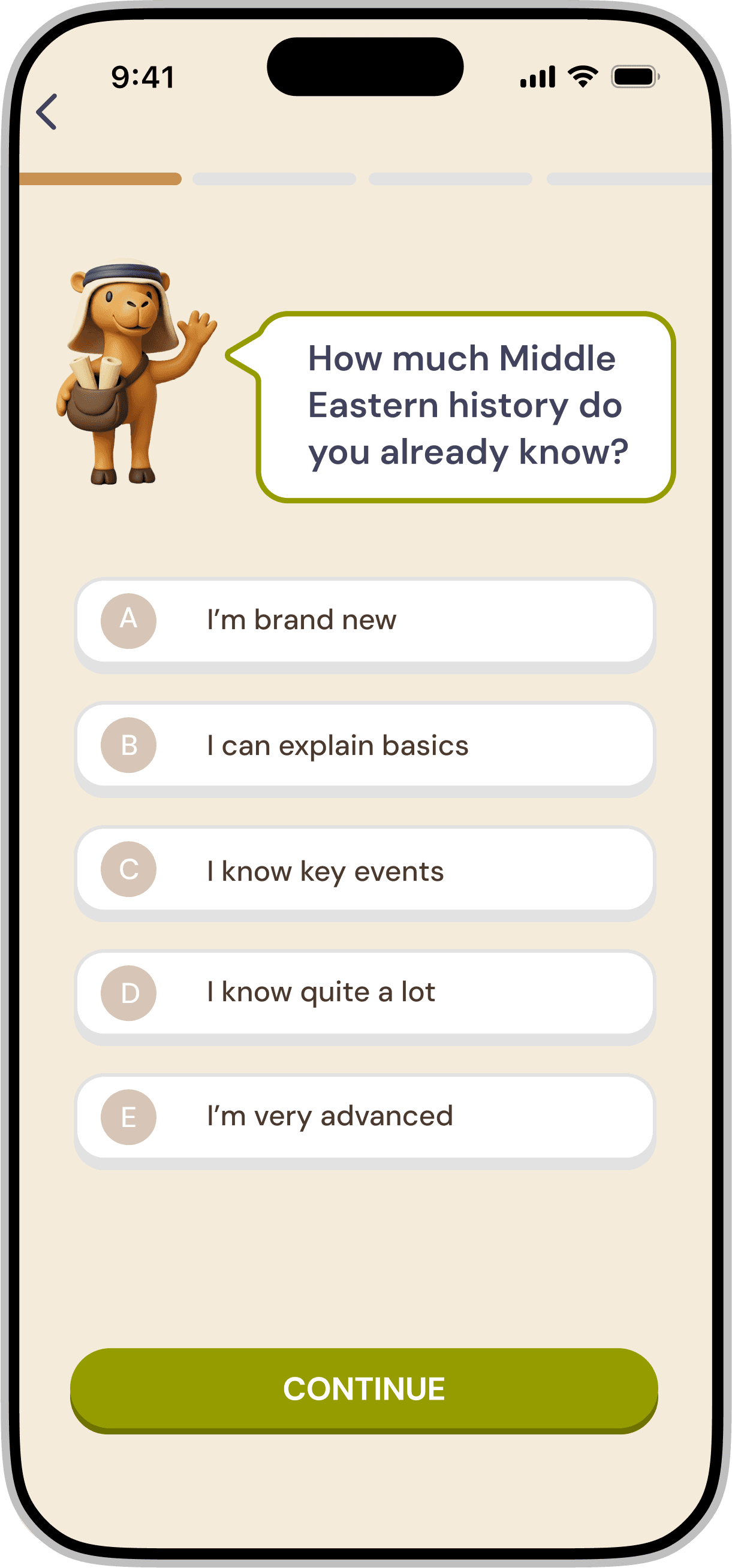
I joined the project after the initial user flows and base structure were in place. My primary focus became simplifying navigation, creating a cohesive design system, and enhancing engagement through visual storytelling and character animations.
PROCESS 🖊️📋👨🏻💻
DOMAINS
User Experience Design
User Interface Design
Brand Design
Character Design
Animation
Education
RESPONSIBILITIES
Mapping UX flows
UI Design
Prototyping
AI Integration
Character Animation
Reward Loops
Art Direction
TOOLS
Figma
Adobe Creative Suite
Rive
Google Flow Labs
NanoBanana
Higgsfield
Procreate
Mobbin
1
2
3
4
5
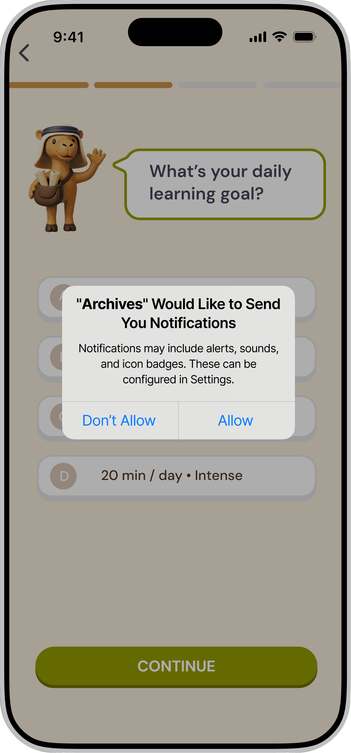
Mapping flows
Entry Points
Onboarding
Lesson Loops
Reward Cycle
Edge Cases
Integration
Narrative System
Game Mechanics
Progress Tracking
Design System
Crafting
Wireframing
Interactions
UX pointers
Character Design
Visual Design
Production
Asset Pipeline
Dev Collaboration
On-going features
User testing
Next steps
MAPPING FLOWS 📲👀📚


The core loop follows a consistent rhythm:
Learn → Interact → Play → Reward → Progress
This structure design alone increased the onboarding completion from 18% to ~65%.
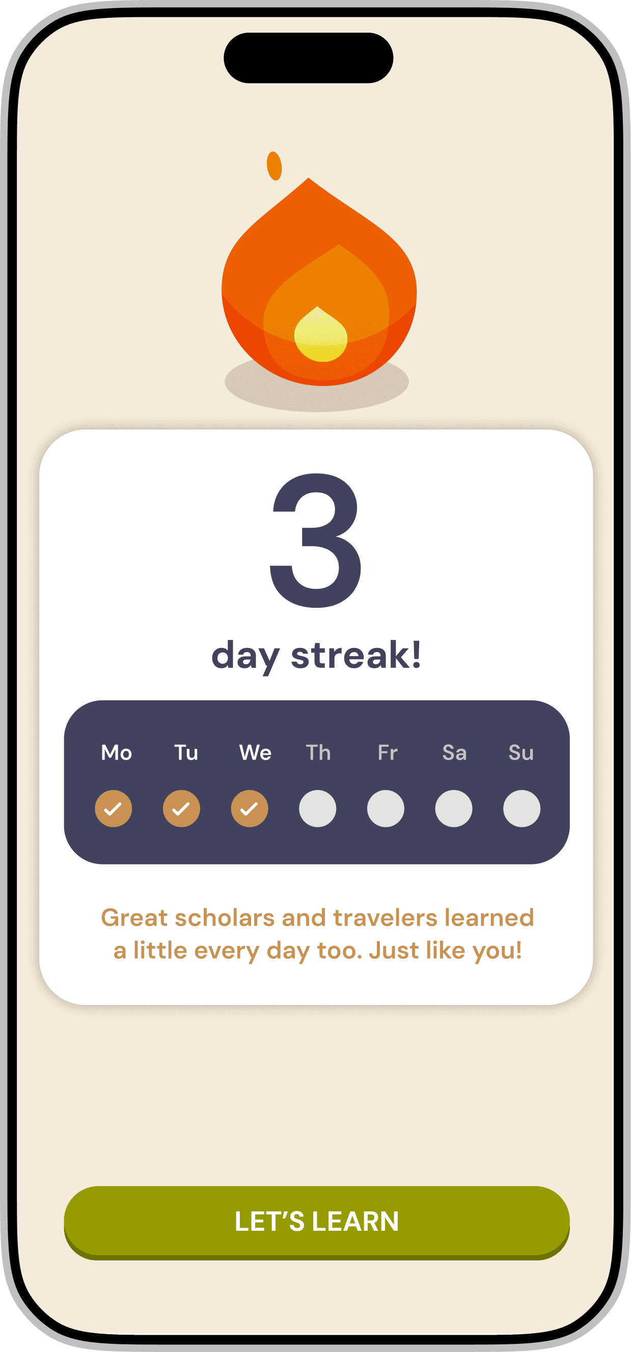
Rewards are layered with visual feedback, progression metrics, and character reactions creating micro-moments of accomplishment without overwhelming the user.
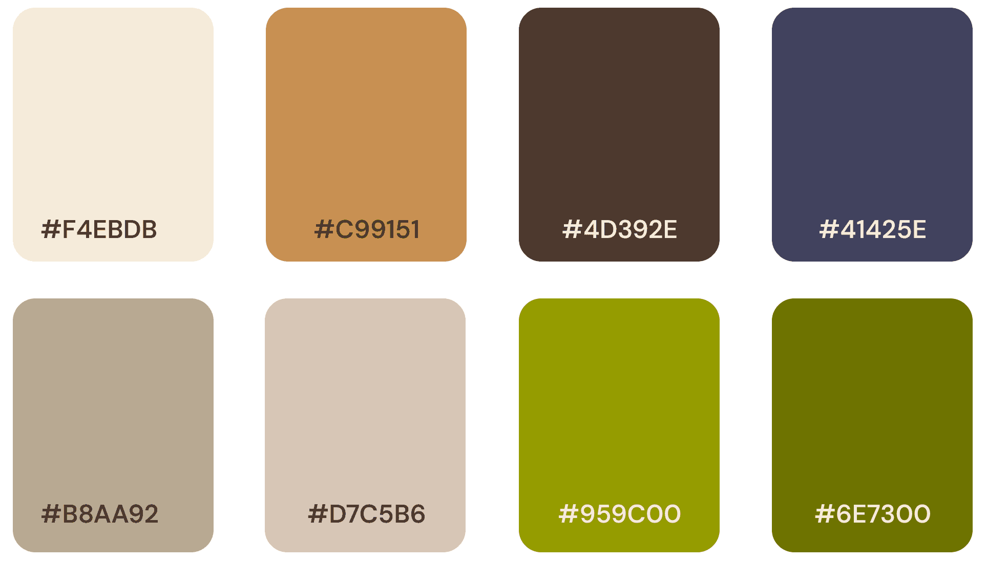

The color palette was designed to balance clarity and warmth. Educational products often risk feeling either overly playful or overly academic; the palette intentionally sits between these extremes to support storytelling while maintaining readability and focus. Primary colors provide structure across navigation and key actions, while secondary accents highlight interactive elements and reward moments throughout the learning flow.
CRAFTING 🛠️🎨🧑🏻🎨


- the needs of the end user,
- the consistency of the design system, and
- the educational intent of the product.
The characters were designed to guide the experience in a natural and approachable way, rather than acting like traditional instructors. Through different poses and visual expressions, they respond to moments across the product and help reinforce feedback, progress, and achievement
This subtle layer of personality helps make the experience feel more human and engaging, while still keeping the interface clear and focused on the learning journey.

Large touch targets and clear visual hierarchy ensure key actions are easy to find and interact with. Navigation remains predictable across the experience, while interactions rely on simple gestures such as tapping and swiping. This approach reduces cognitive load and supports accessibility across different reading and digital literacy levels.
TUTORIAL & DELIGHT ✨🥰👨🏻💻
Together, the onboarding tutorial and home screen establish the user’s mental model early, allowing them to focus on exploring the content rather than learning the interface.
ON-GOING FEATURES 🔜🛠️🎨
The product is evolving based on real engagement data and behavioral patterns.
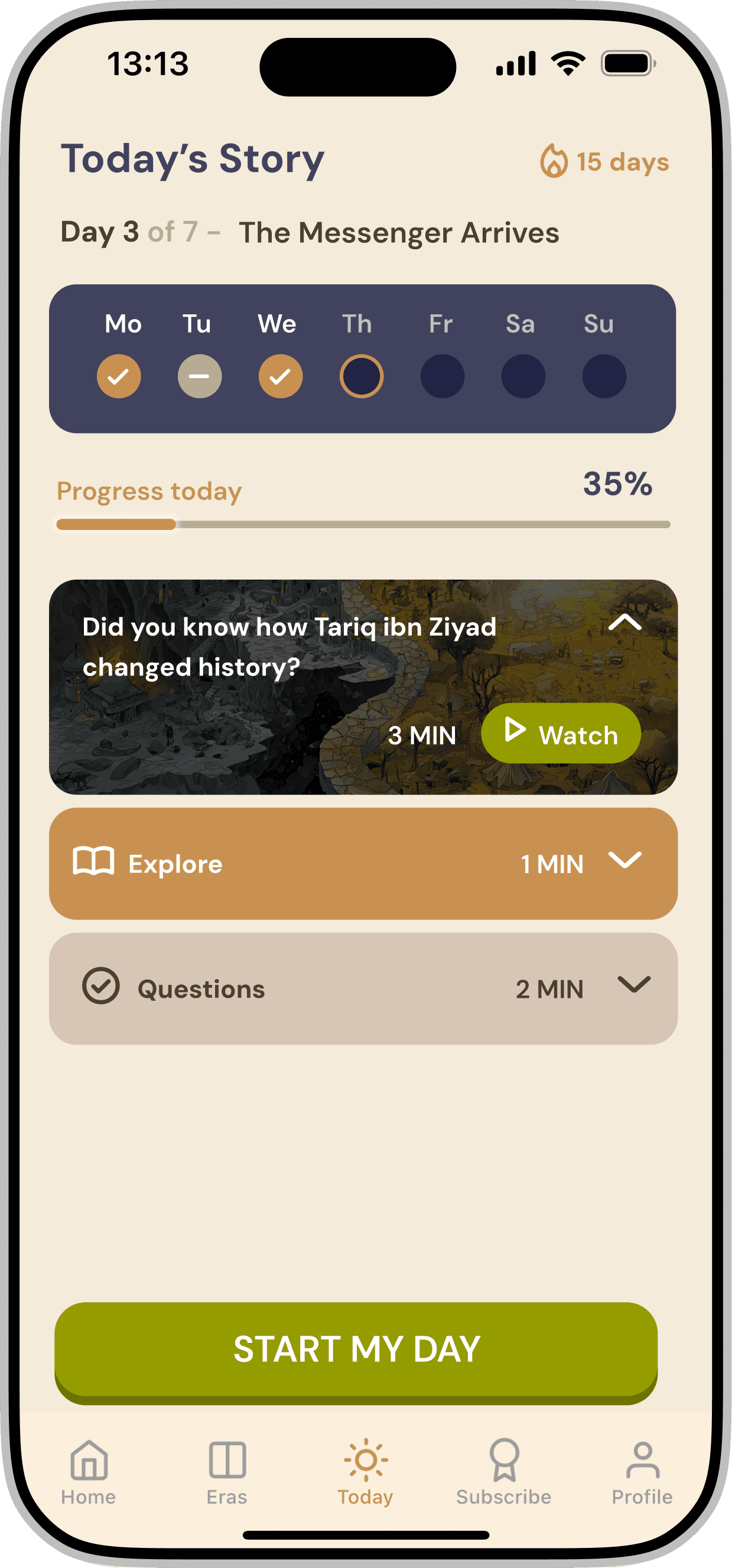
New interactive lesson types are being introduced to deepen subject immersion. With Long-term engagement strategies are being layered into the progression system.
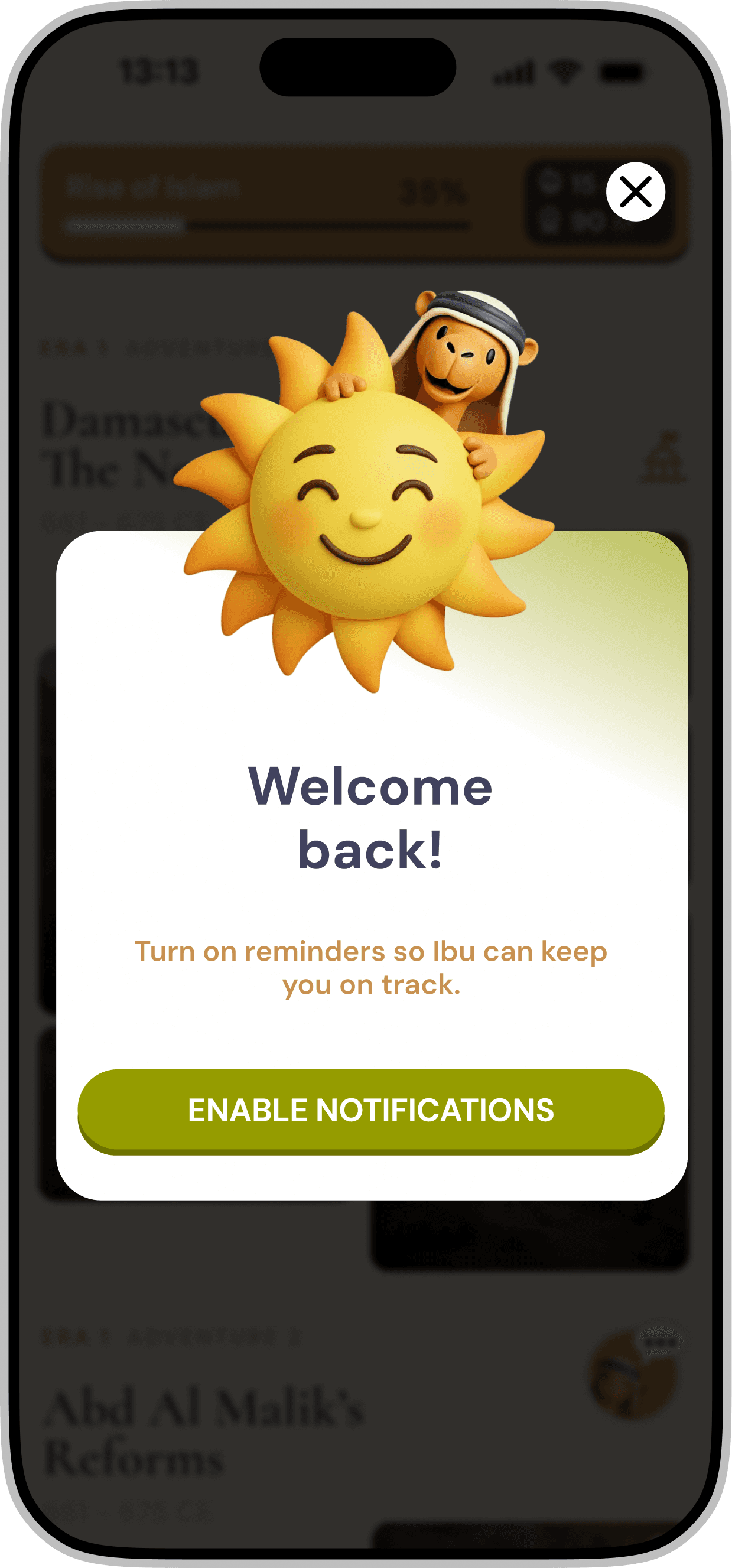
To support retention goals, we as a team introduced a daily story series within the app. The idea was to release one episode each day, encouraging users to return regularly and continue the narrative over time.
This format helped build a sense of anticipation and routine, making the learning experience feel more like an ongoing story rather than a one time interaction. And a ~45% improvement in weekly active users.

Android Playstore and iOS Appstore live product listing.

USERS SHOWERING LOVE ❤️💬☺️
Just a few snapsots of users loving the product. This part of my project journey is called "happiness".


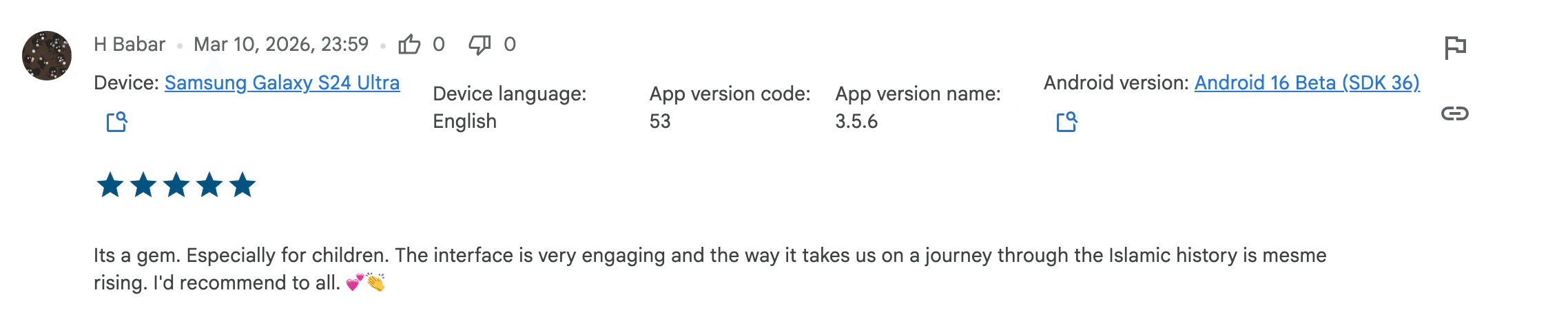
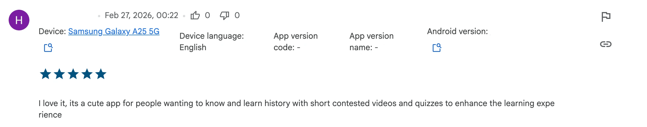
And over 100 additional five star reviews with average 4.95 stars on the Play Store and App Store.
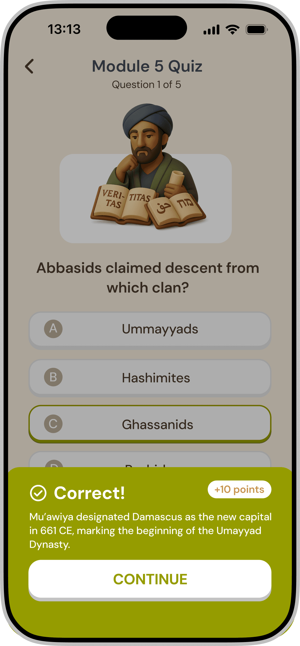
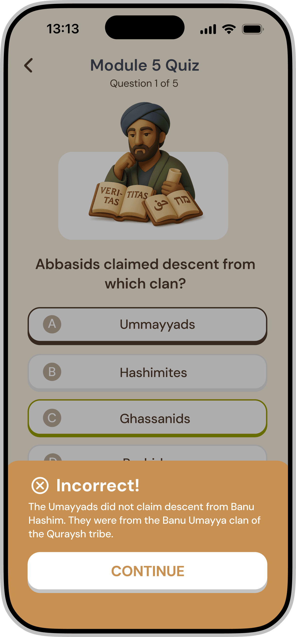
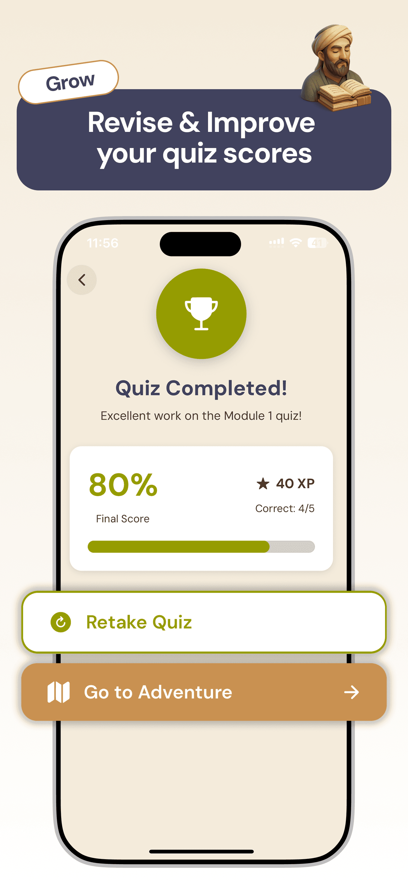
To enhance the quiz feedback experience, I designed three animated states of our mascot, Ibu, each tied to a different quiz score range. The goal was to create a more emotional and motivating feedback moment for users.
INTEGRATION 🤔🔜👨🏻💻
The product was designed as more than a game layered on top of historical content. Instead, the experience functions as an integrated learning system where narrative, interaction mechanics, and visual design work together to support comprehension and engagement.
To ensure consistency across the product, I established a set of foundational design system elements that guide the visual and interaction language of the experience. These foundations include the color palette, typography pairing, and iconography system shown below.
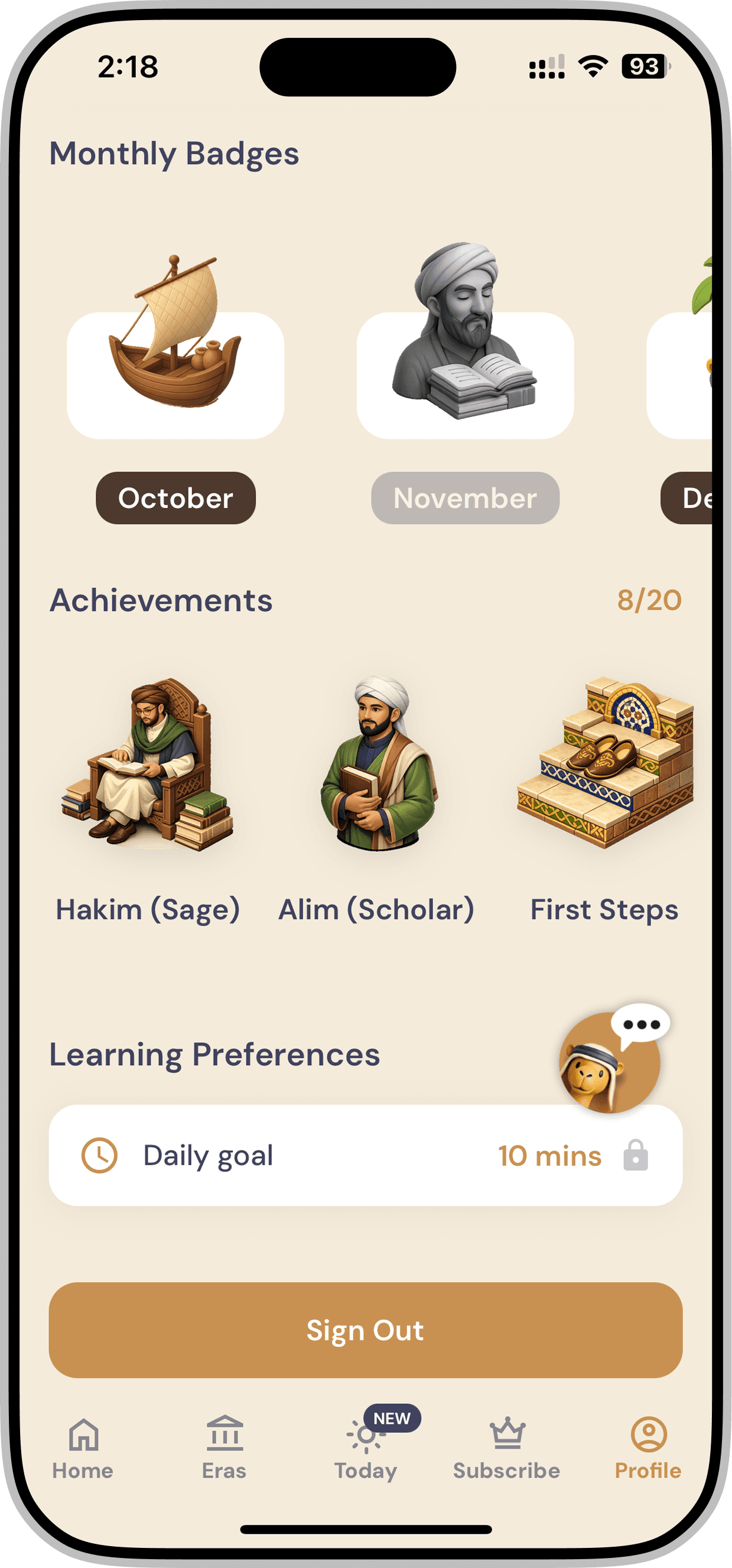
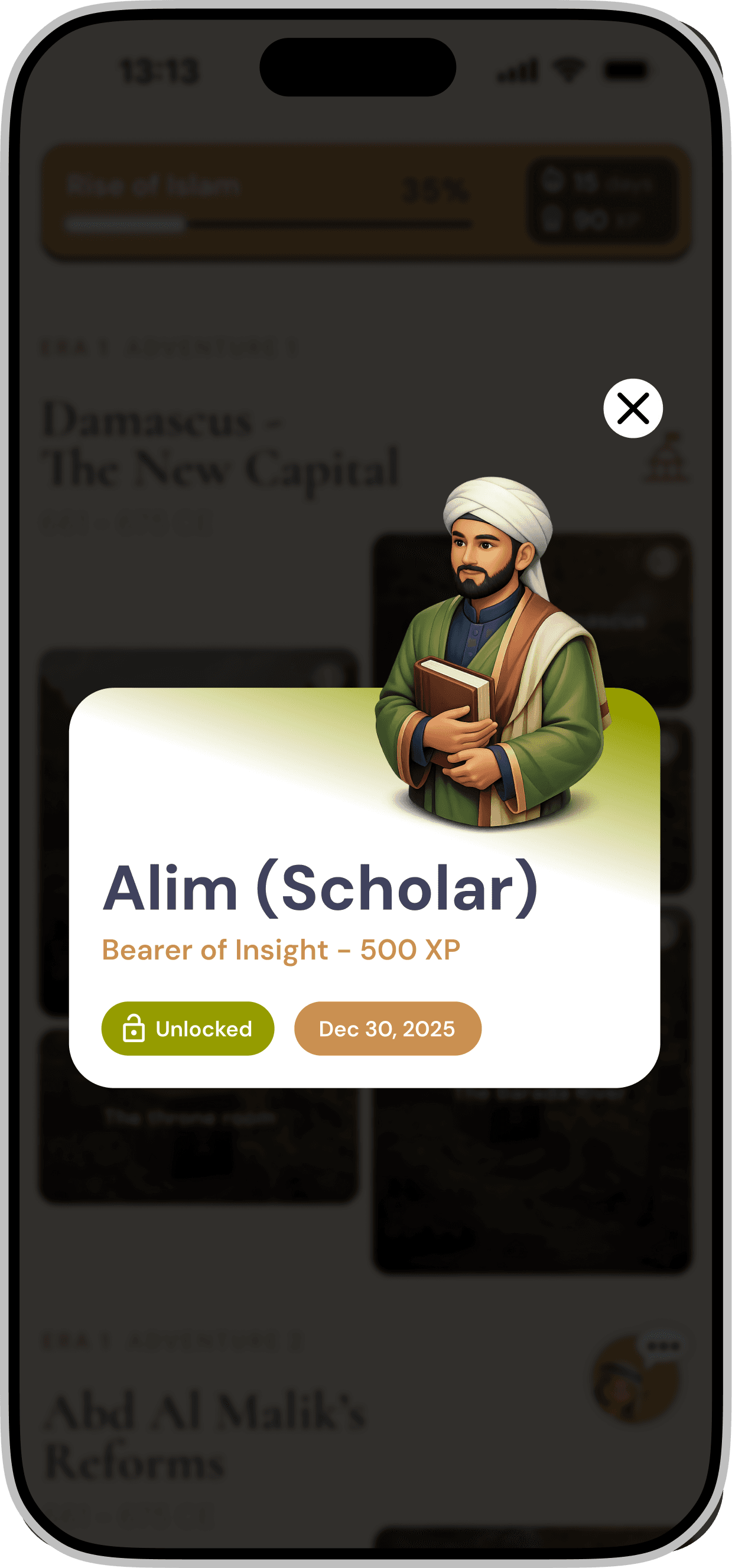
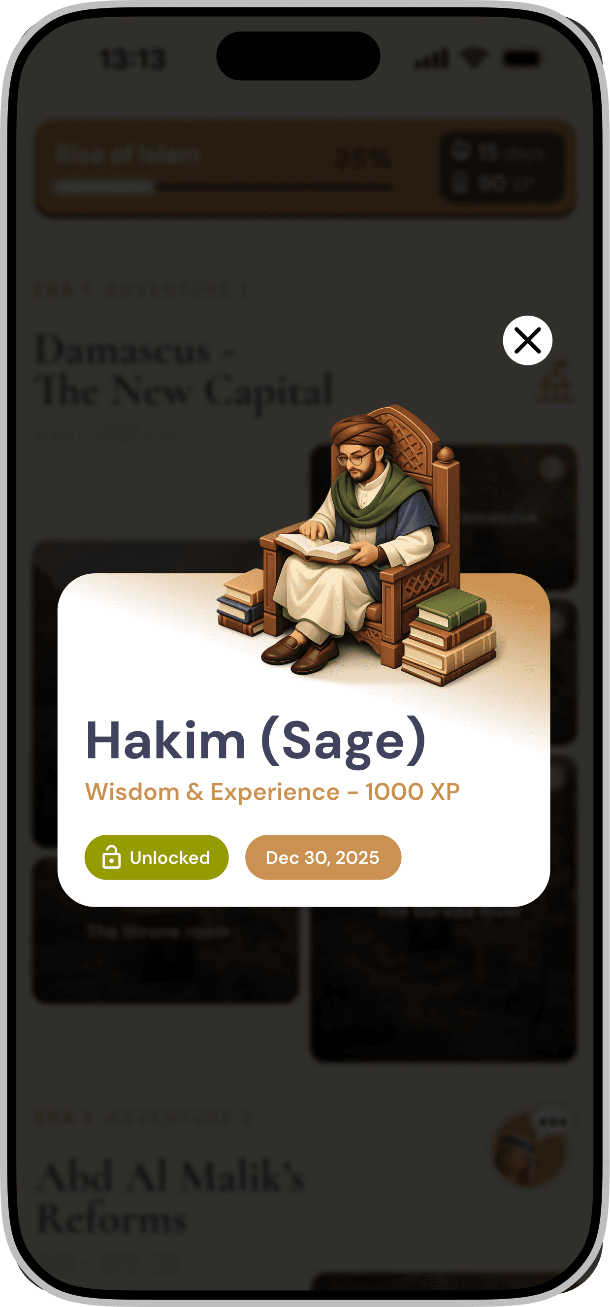
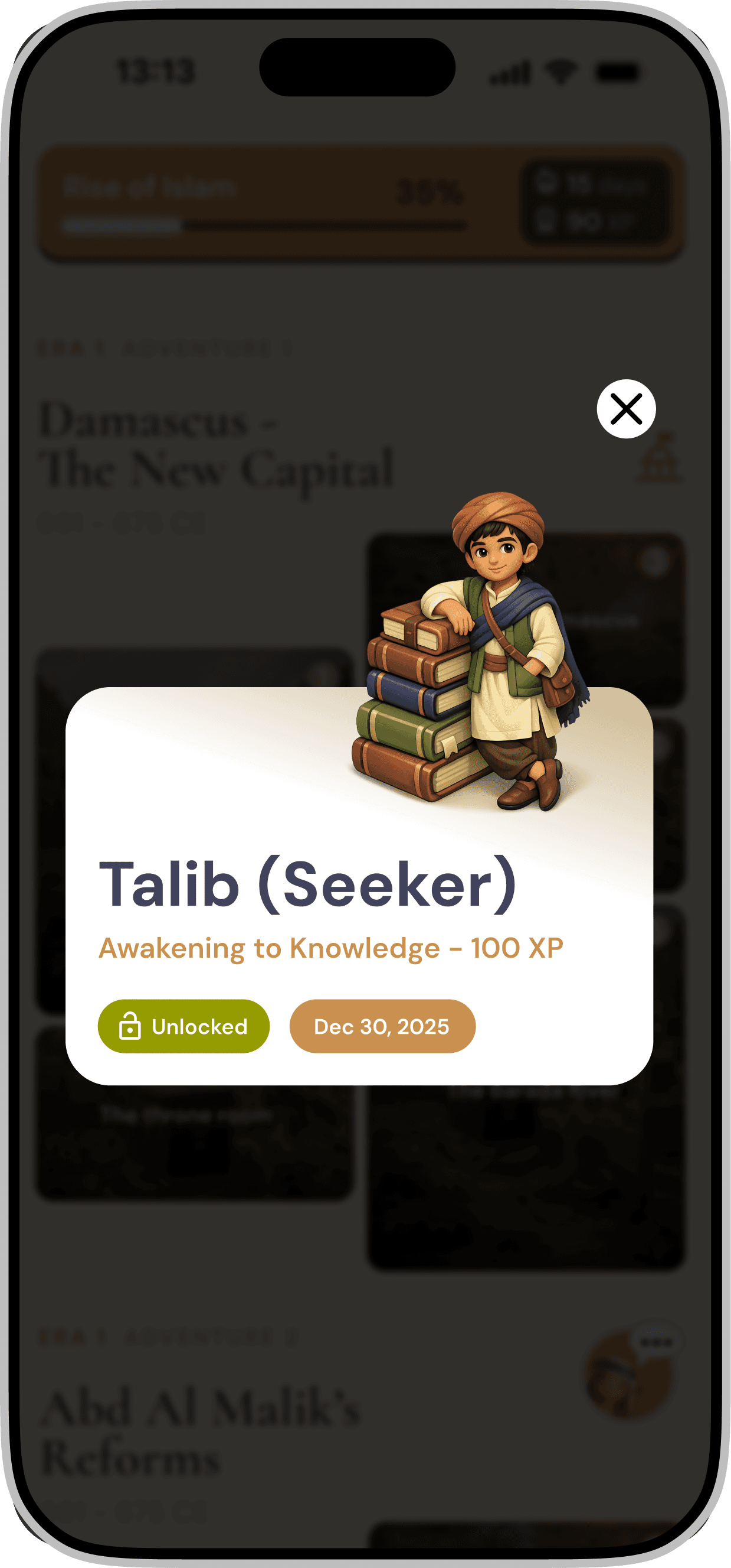
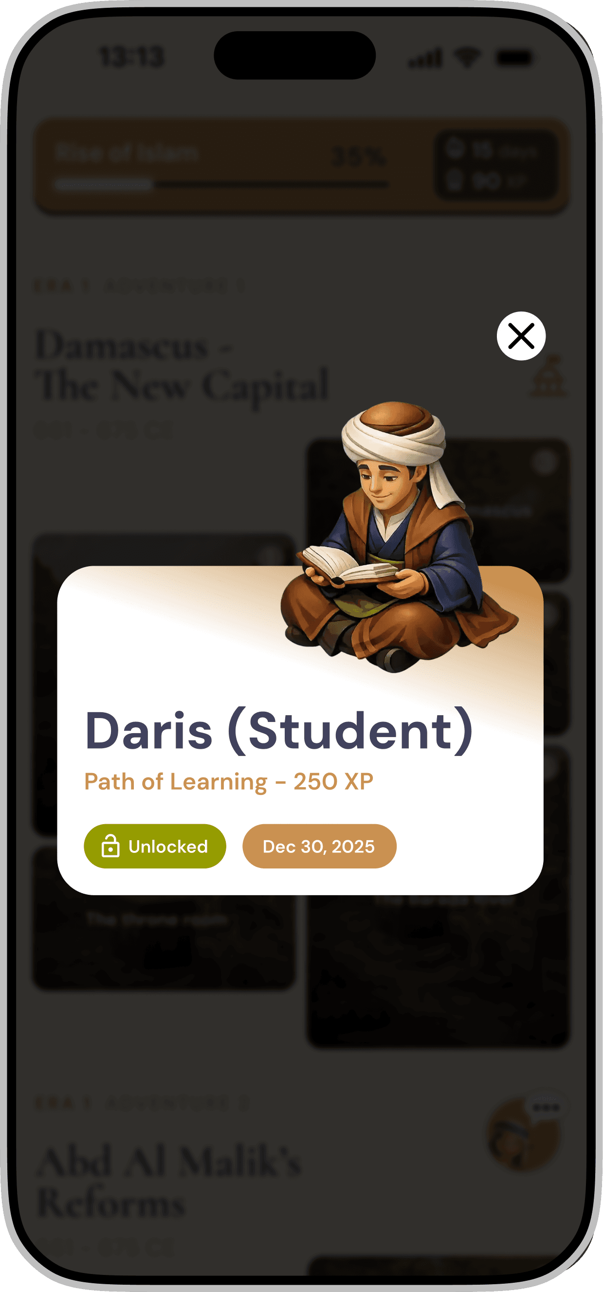
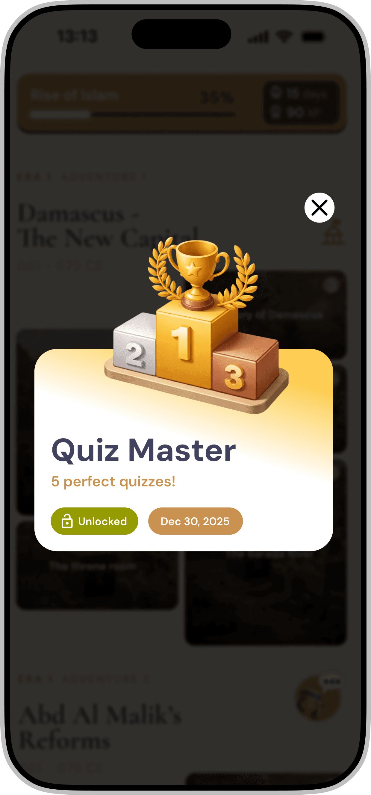
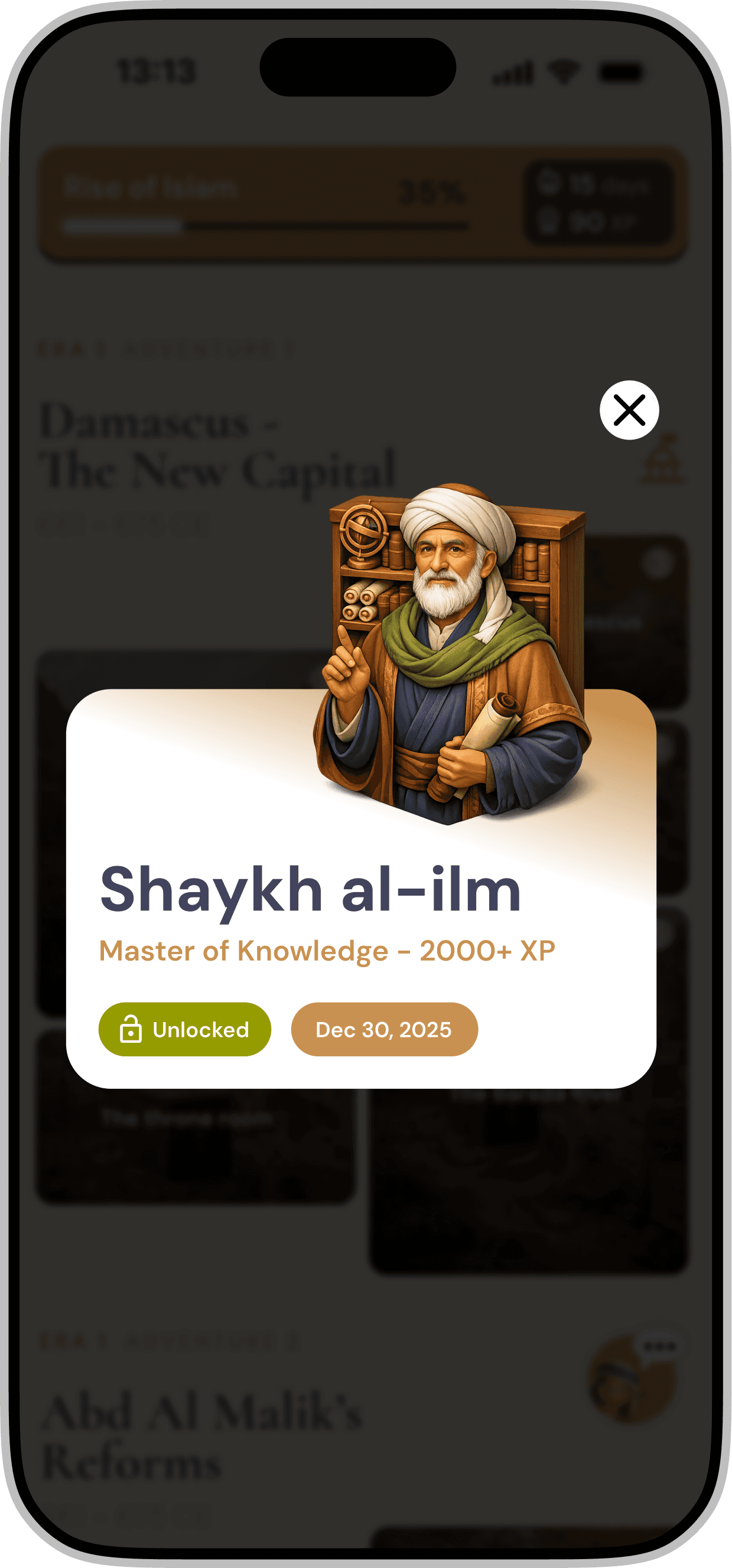
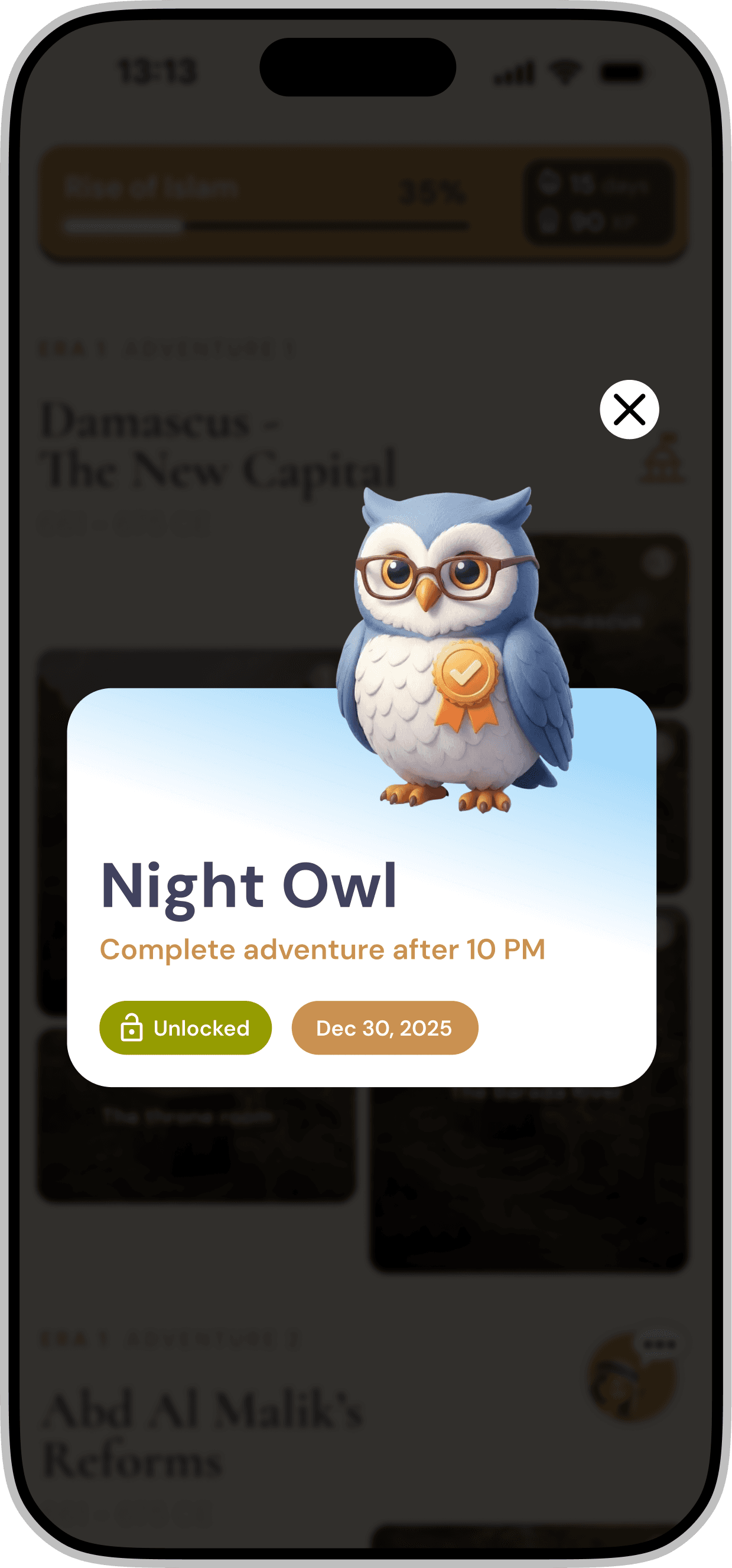
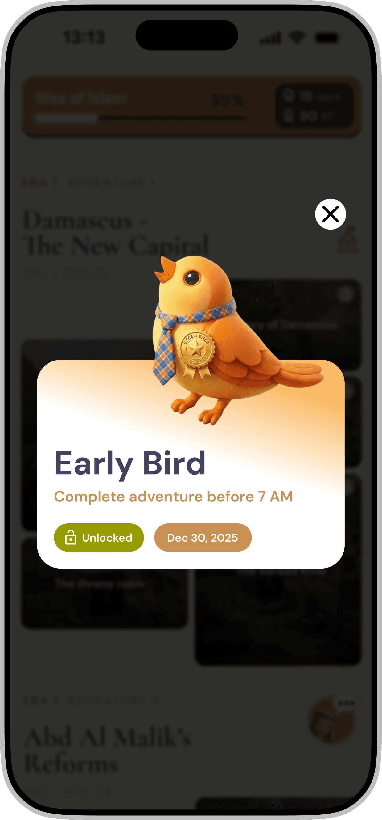
POP-UP BADGES 🔝🎉🏆
Popup badges were introduced later as milestone comparison cards, allowing users to view and share their progress with friends. Each badge is tied to a specific XP milestone, creating a clear and consistent link between achievement and progression within the system.
In addition to progression based badges, we introduced a variety of categories such as Night Owls, Early Risers, and Quiz Masters. This approach ensures that different user behaviors are recognized, allowing more users to earn their first badge early in the experience and feel acknowledged within the system.


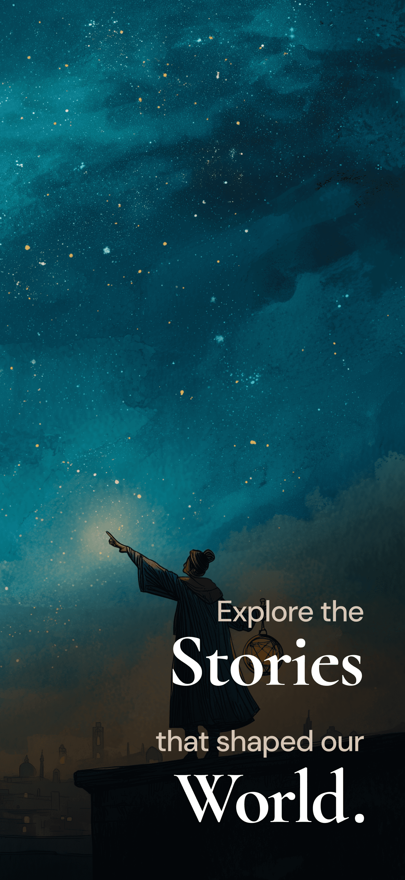
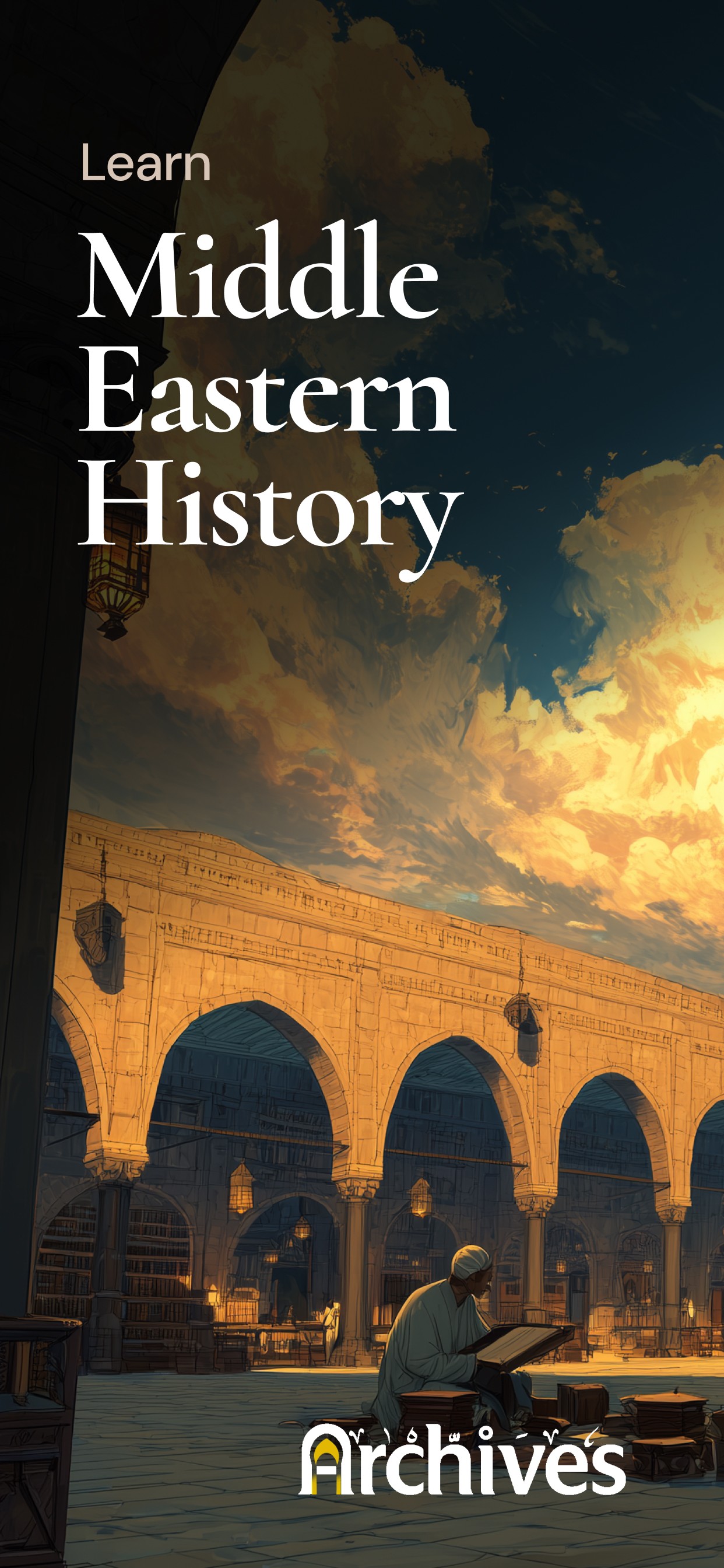
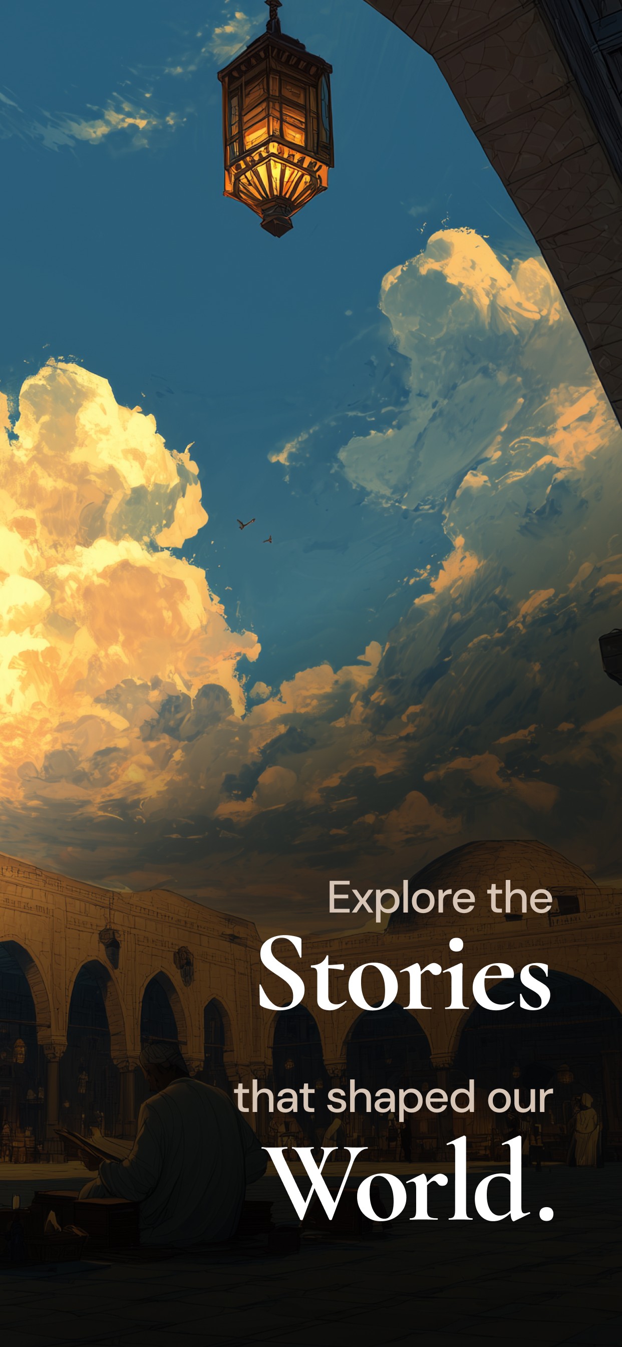
CREATIVE ASSETS 🧑🏻🎨👀📱
I also designed the promotional visuals for the App Store and Play Store listings. These assets were used as part of ongoing analytics experiments to understand which visual directions performed best.
These are some examples of the covers I designed with AI generated images.


Following the cover visuals, I designed a set of supporting store images that highlighted the core features of the app. These screens showcased key parts of the experience and helped potential users quickly understand what the product offers.
The goal was to present the main interactions and learning journey in a clear and visually engaging way, giving users a quick overview of the app before deciding to download.
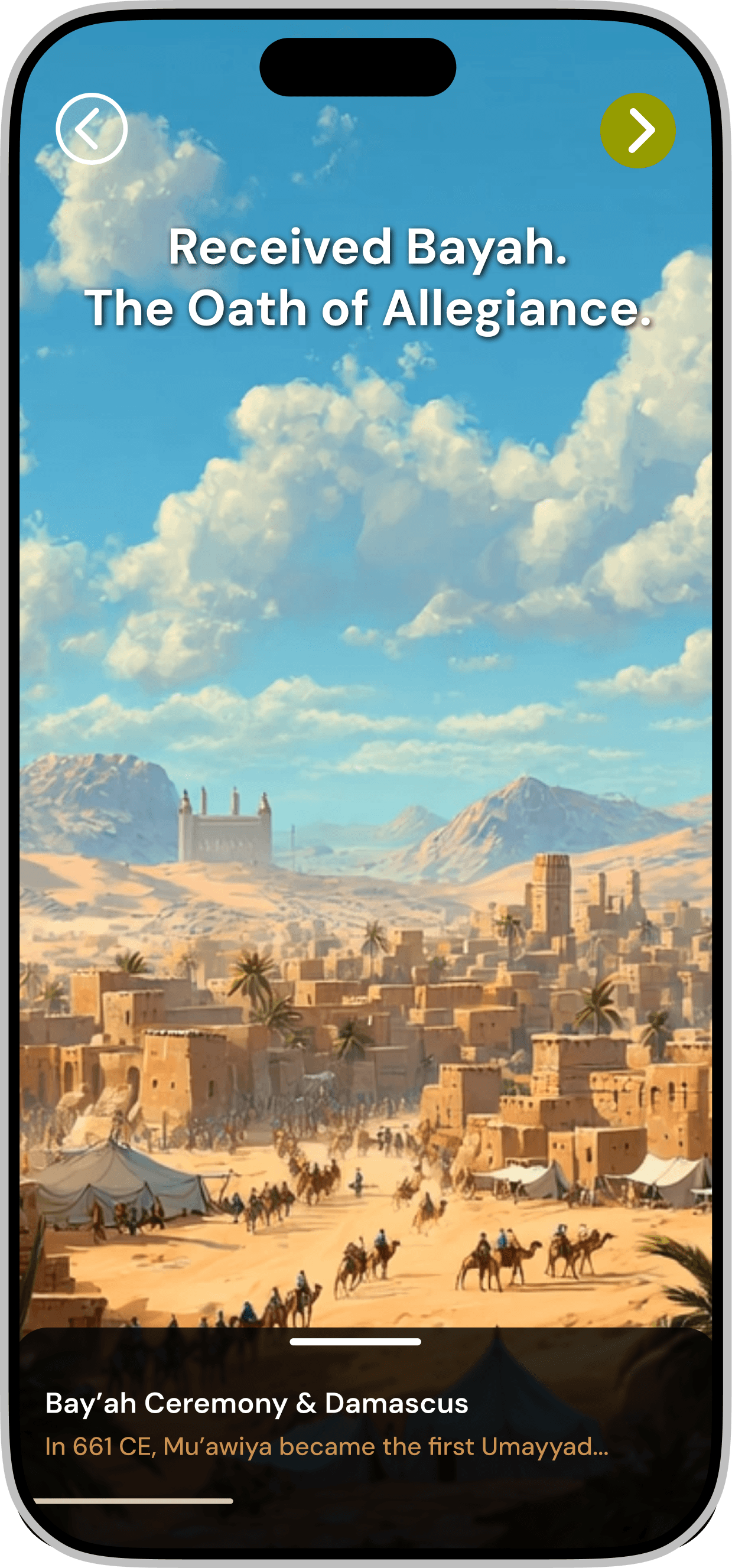
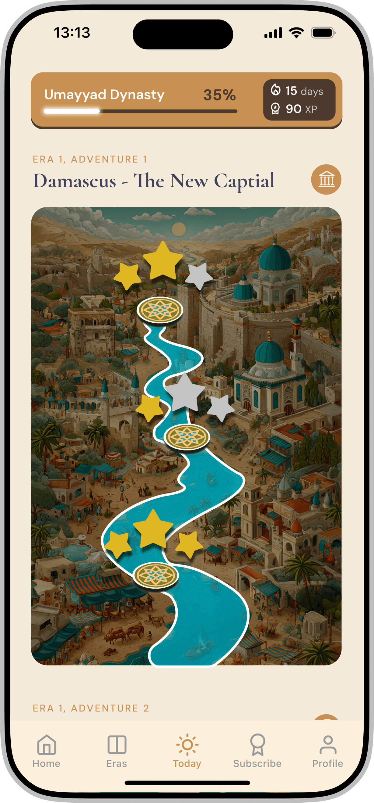
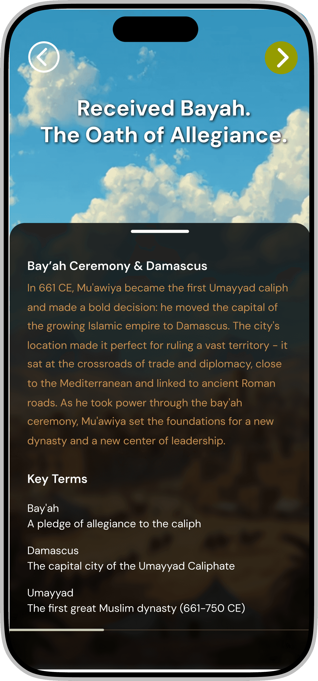
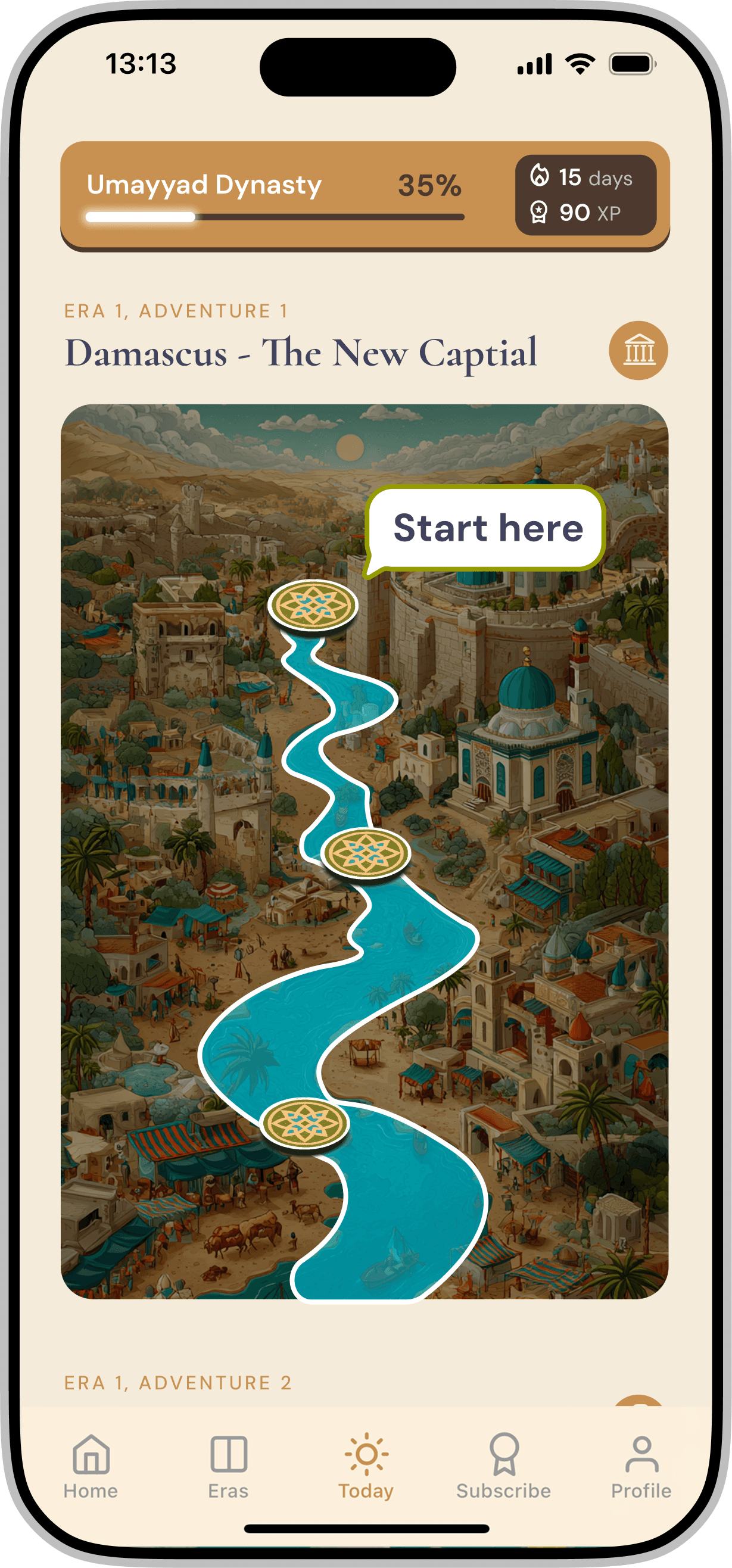
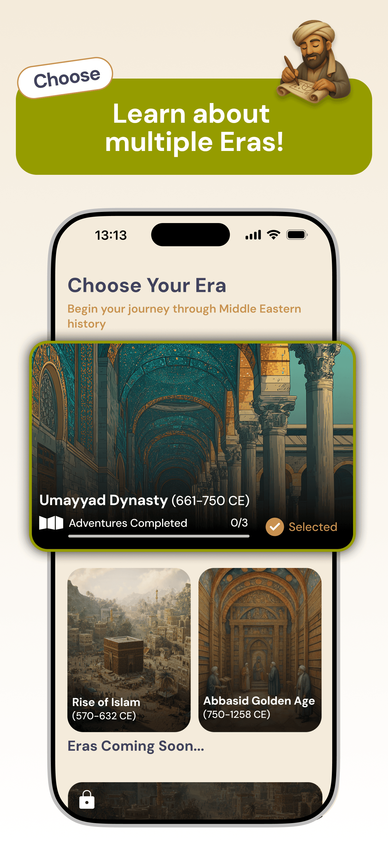
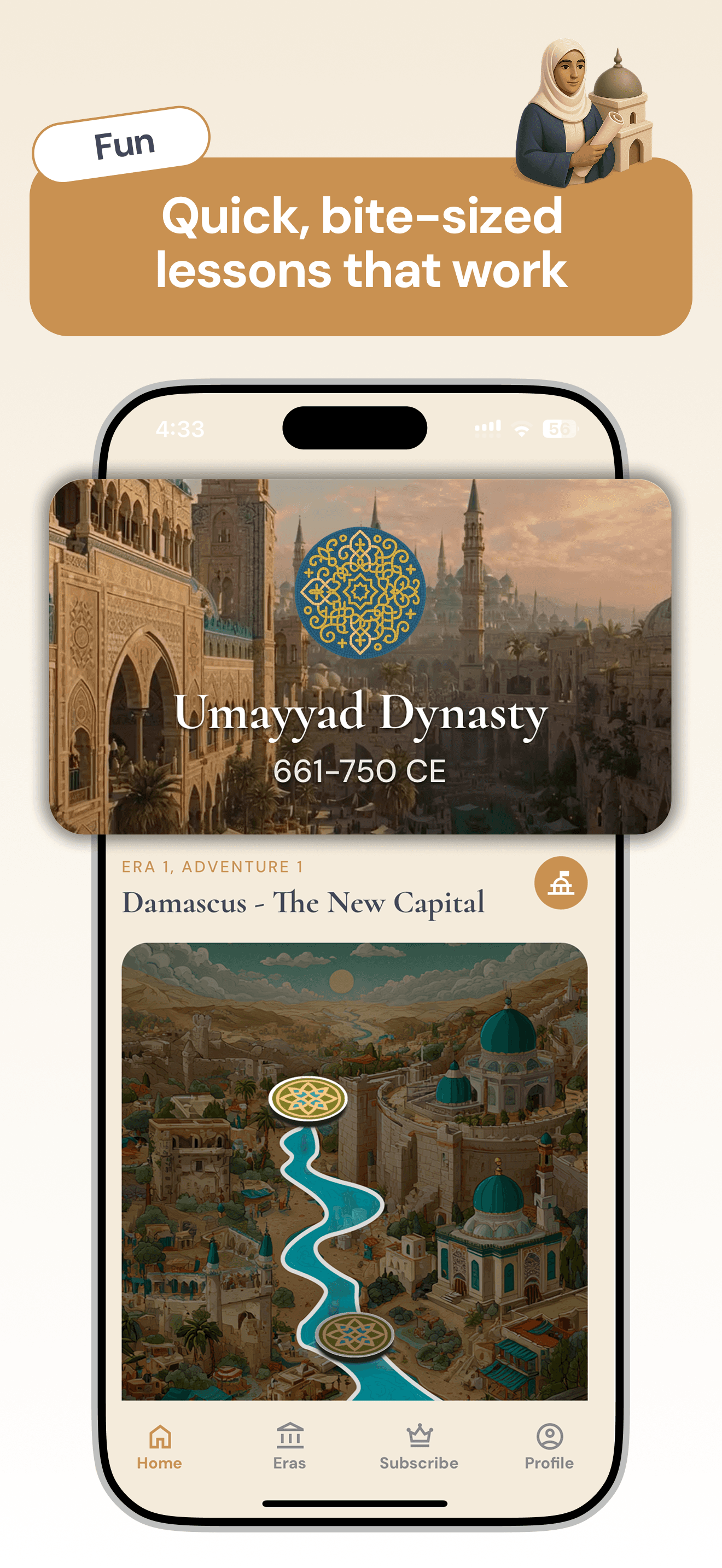
The product experience guides users through selectable historical eras, each structured as a series of modules. Stories are introduced through interactive storytelling formats such as animated videos and carousel narratives.
Each module concludes with a short quiz that provides instant feedback and a small reward moment to reinforce engagement. The overall structure and learning flow were defined by the product manager, and my role focused on designing the experience within that framework.
For lower scores, Ibu appears slightly sad with its head lowered. For mid-range scores, Ibu holds a golden cup to acknowledge the user’s effort. For high scores, Ibu celebrates with a party hat and a large trophy. By keeping the character consistent while introducing different emotions and props, the animations set the mood of the screen and turn quiz feedback into a more memorable reward moment.